Designing a G20 microsite people would stay with, not just land on.
HINDUSTAN TIMES · G20 MICROSITE · 2023
Hindustan Times’ G20 2023 microsite to organise fast-moving summit coverage into a scannable, interactive experience for journalists, students, policymakers and general readers.
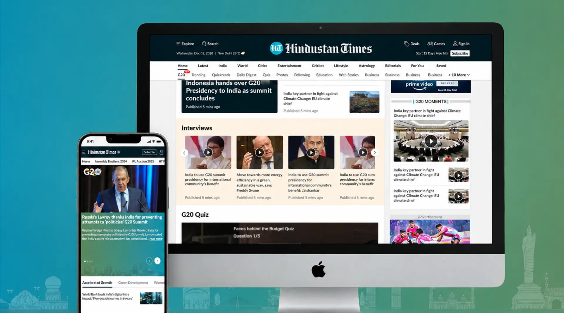
The challenge was to help readers move between live updates, explainers, interviews and G20 context without turning the page into an endless feed.
Challenge
One page had to serve very different readers without becoming a content dump.
The microsite needed to serve journalists, students, policymakers and general readers while balancing real-time reporting, in-depth explainers, interactive features and advertising. The UX problem was not a lack of content; it was giving that volume a hierarchy people could scan, understand and keep exploring.
Research & Analysis
The structure started with audience needs, not page modules.
Four audiences, two core needs.
Needs analysis across journalists, students, policymakers and general readers surfaced two priorities: quick access to categorised topics and interactive tools for complex summit context.
Information architecture
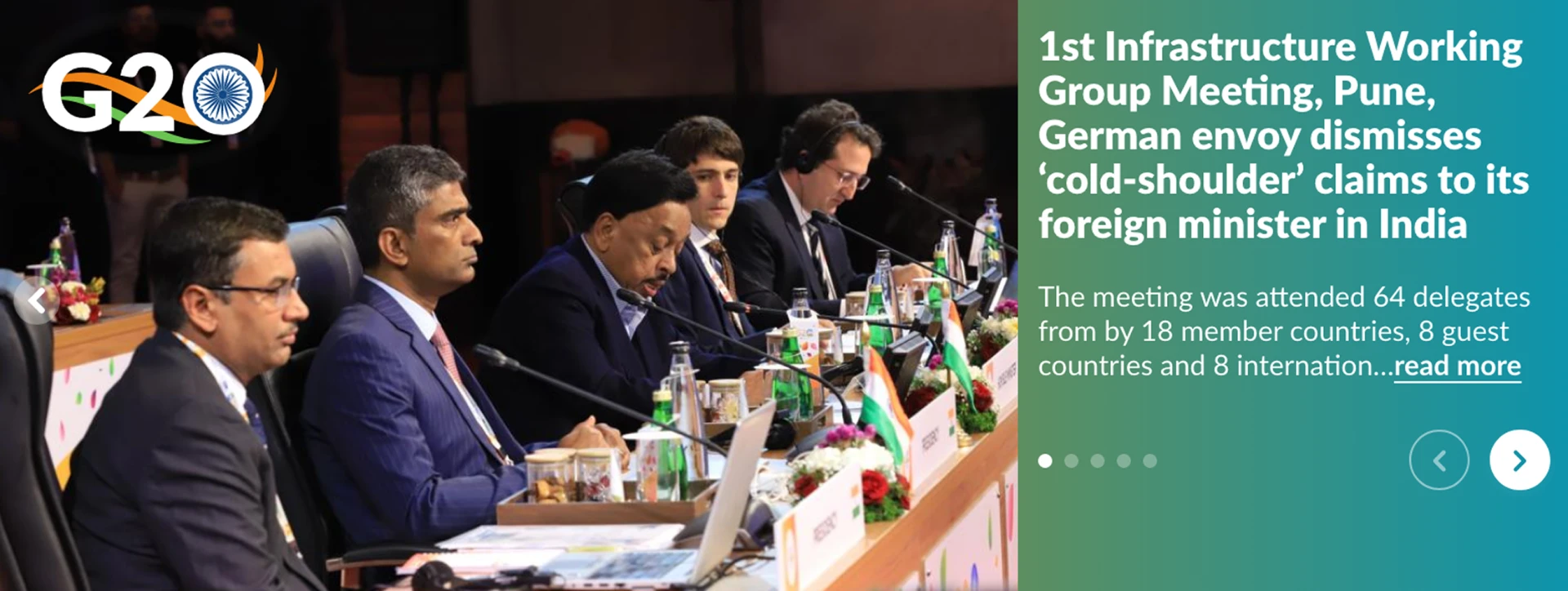
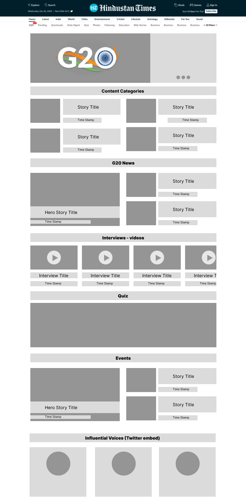
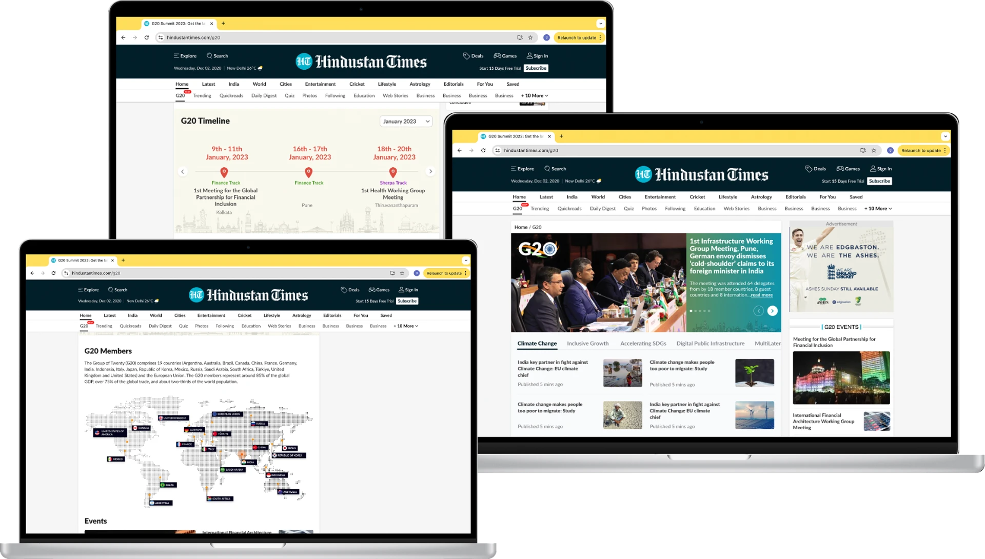
Wireframes mapped the hero, topic tabs, modular grids, interviews, quiz, timeline, members and events.
Iterate with stakeholders
Stakeholder feedback refined hierarchy, navigation and ad placement.
Product Direction
Treat the microsite as a layered information system, not a long news page.
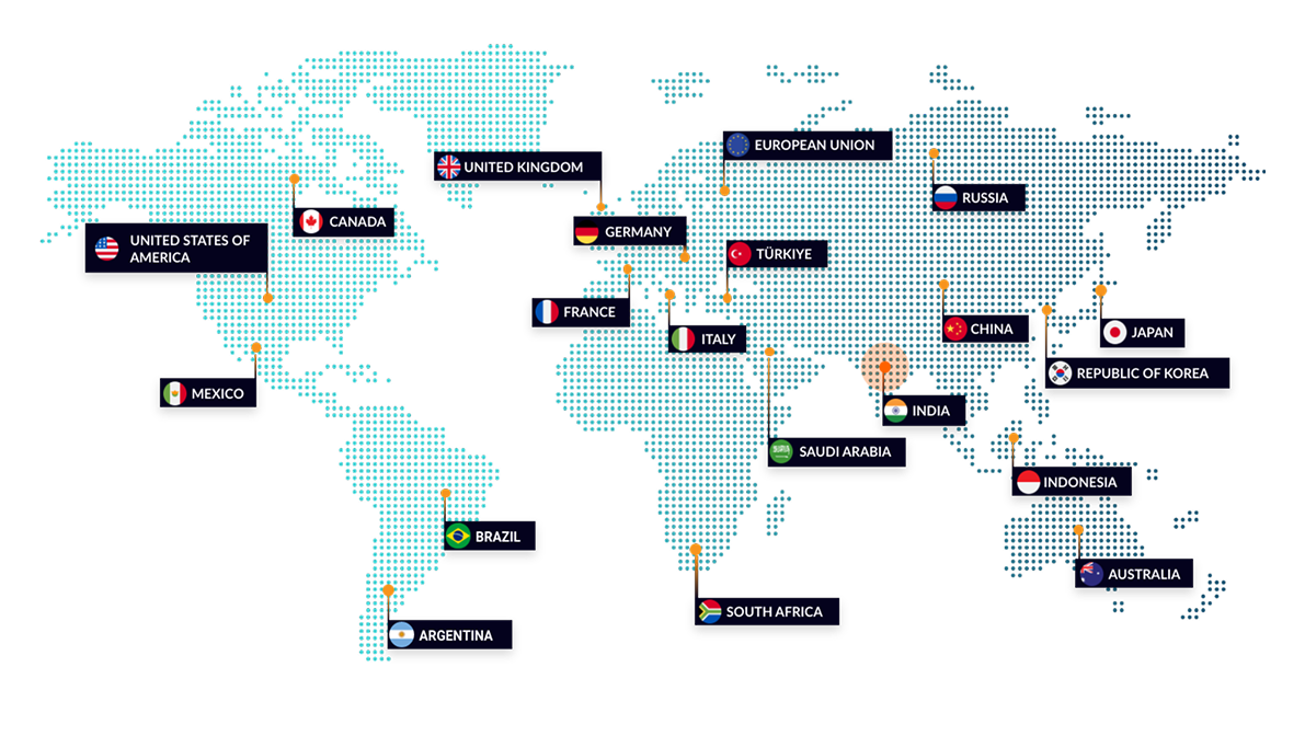
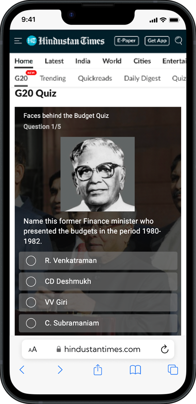
The design separated immediate updates from deeper context. Topic tabs and modular grids supported scanning, while the quiz, timeline and G20 members map gave readers reasons to pause, interact and understand the summit beyond individual headlines.
Experience System
Give every type of content a clear job.
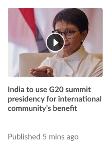
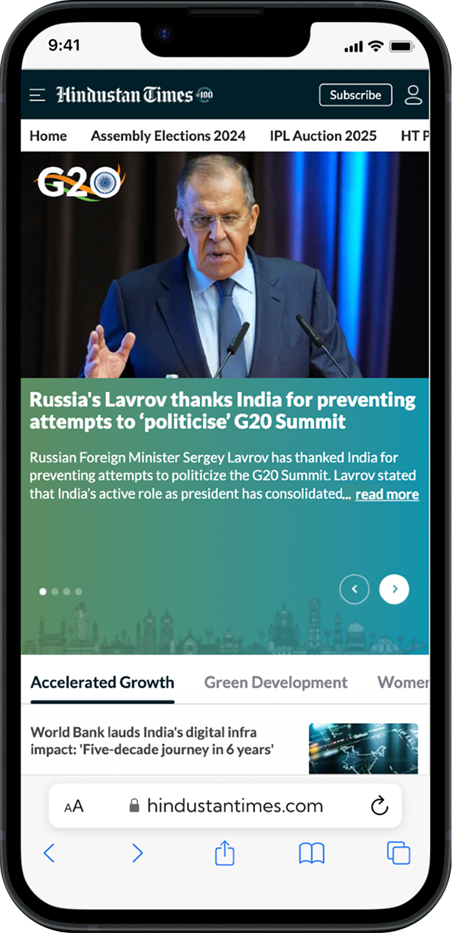
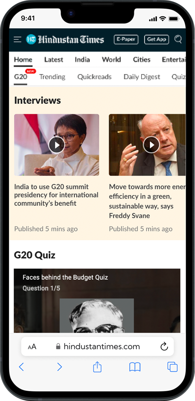
Rather than treating the microsite as one continuous feed, the final system combined distinct modules for breaking stories, topic-based news, interviews, quiz, timeline, members, events and influential voices. Each pattern supported a different reading mode while still feeling like Hindustan Times.
Scan by topic
Topic tabs and modular grids let readers move quickly between themes such as Climate Change, Inclusive Growth and Digital Public Infrastructure.
Interact with context
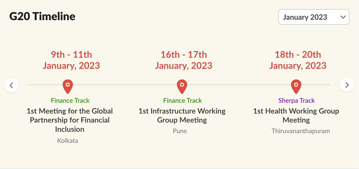
The quiz and horizontal timeline turned summit facts and chronology into experiences readers could actively explore.
Keep the ecosystem connected
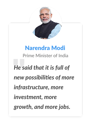
Members, events, interviews and influential voices added global context without competing with the primary news hierarchy.
Responsive Experience
The same hierarchy had to survive from desktop depth to mobile urgency.
On desktop, the microsite could expose multiple content layers at once. On mobile, the hierarchy compressed into clear cards, topic navigation and focused interactive moments without losing access to interviews, quizzes or core G20 coverage.
Impact
Readers stayed far longer than on a typical HT topic page.
The G20 microsite recorded an average session duration of 377 seconds, compared with the 80–110-second range documented for typical Hindustan Times topic pages. It also recorded an 18% bounce rate, showing sustained exploration of the experience.
Takeaway
For content-heavy products, engagement starts with deciding what deserves attention first.
The G20 microsite worked by turning volume into structure—using hierarchy for scanning, interaction for context and responsive patterns to keep the experience useful across devices.