A long listicle is not yet a useful buying guide.
MINT · HT MEDIA · 2023 - 2024
Mint’s affiliate listicle format redesigned to turn long, text-heavy product roundups into a clearer decision journey, with prioritised recommendations, easier comparison, progressive product details and stronger purchase cues.
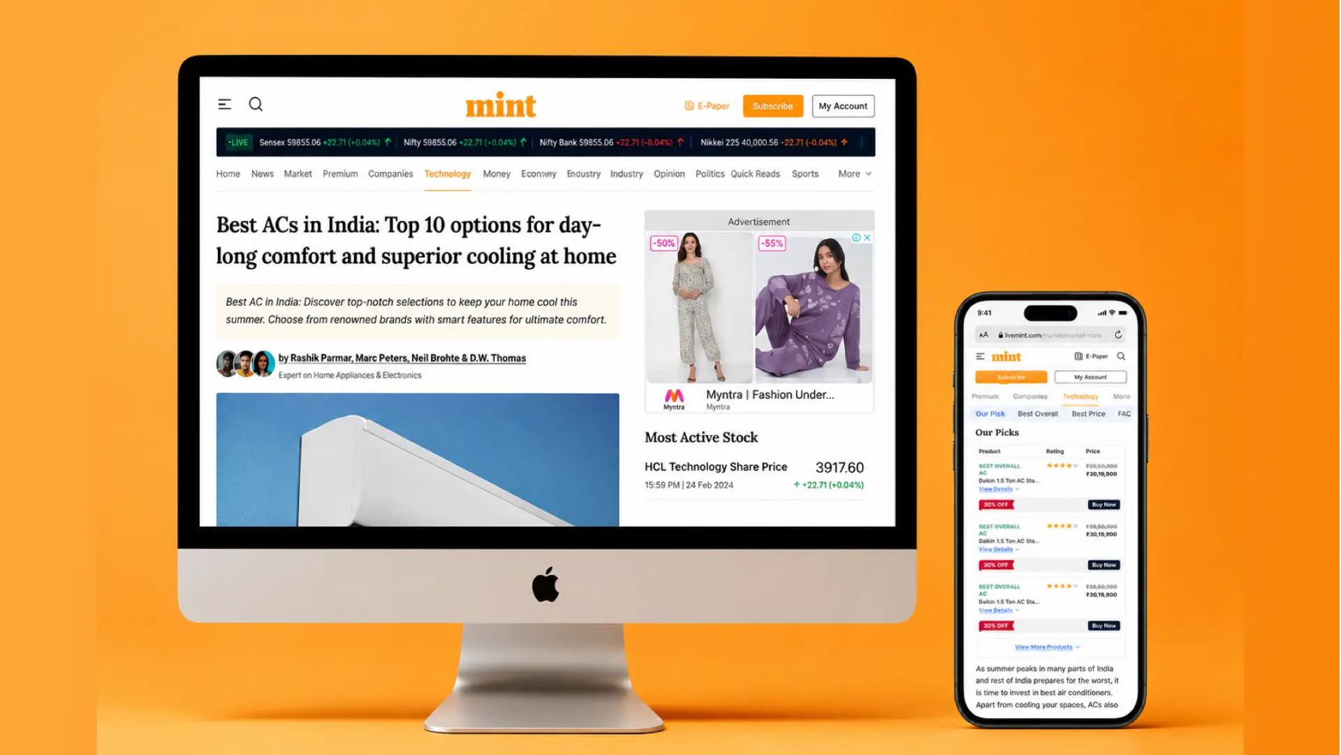
Mint’s affiliate listicles are commercial editorial pages for high-consideration products such as home appliances and gadgets. The redesign had to support both reader confidence and business performance without making the page feel like a catalogue.
Challenge
The page asked readers to read everything before they could decide anything.
The original experience was dense and structurally flat. Product information was difficult to scan, navigation through the list was inefficient, calls to action were easy to miss, and the page did not give readers a clear way to compare products. The structure also limited opportunities for stronger search discoverability.
Approach
The redesign had to balance editorial depth, search discoverability and purchase intent.
The work focused on making long product roundups easier to navigate without stripping away the depth that supports editorial credibility and SEO. The structure needed to help readers orient quickly, compare options, reveal detail progressively and reach a purchase action without repeatedly scrolling back through the article.
Improve discoverability
Use clearer headings, comparison structures and concise summaries so the page is easier to understand and index.
Reduce decision effort
Turn dense product detail into scannable cards, comparison patterns and progressive disclosure.
Support conversion
Make purchase actions visible at the moments where readers have enough context to decide.
What must a reader know before choosing?
Direction: prioritise → compare → reveal detail → act
Product Direction
Turn the article from a product list into a decision system.
The redesign reorganised the page around the decisions a reader makes: first understand which products matter, then compare the strongest options, then inspect the details that justify a choice. Secondary information stays available without competing with the primary decision.
Key Design Features
Make the most useful information visible first.
The interface prioritised information that helps a reader make a decision, then revealed deeper product detail only when it became useful.
Prioritise recommendations
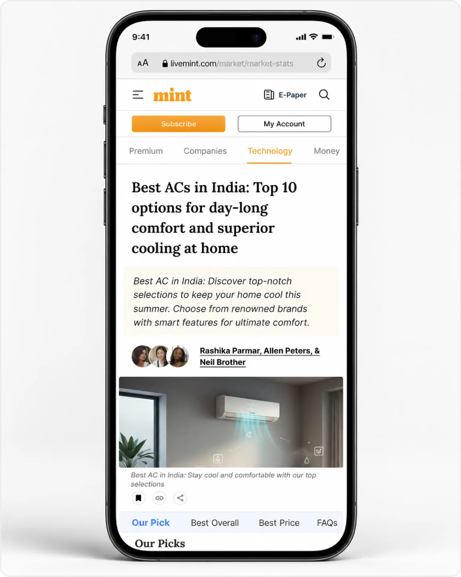
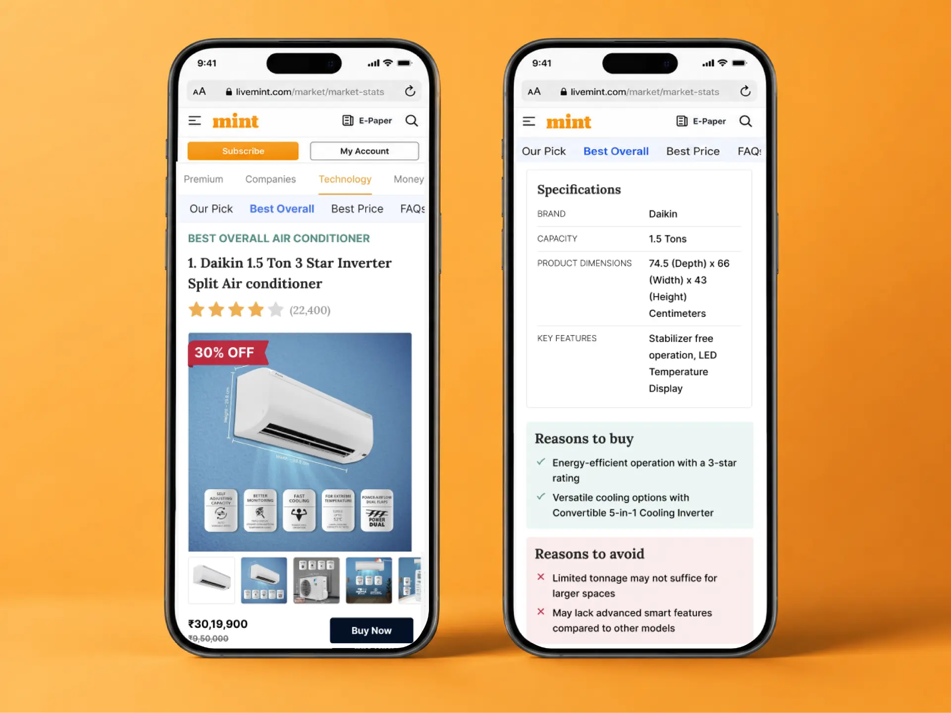
Trust tags such as “Our Pick”, “Best Overall” and “Best Price” give readers a clear starting point instead of treating every product equally.
Compare before detail
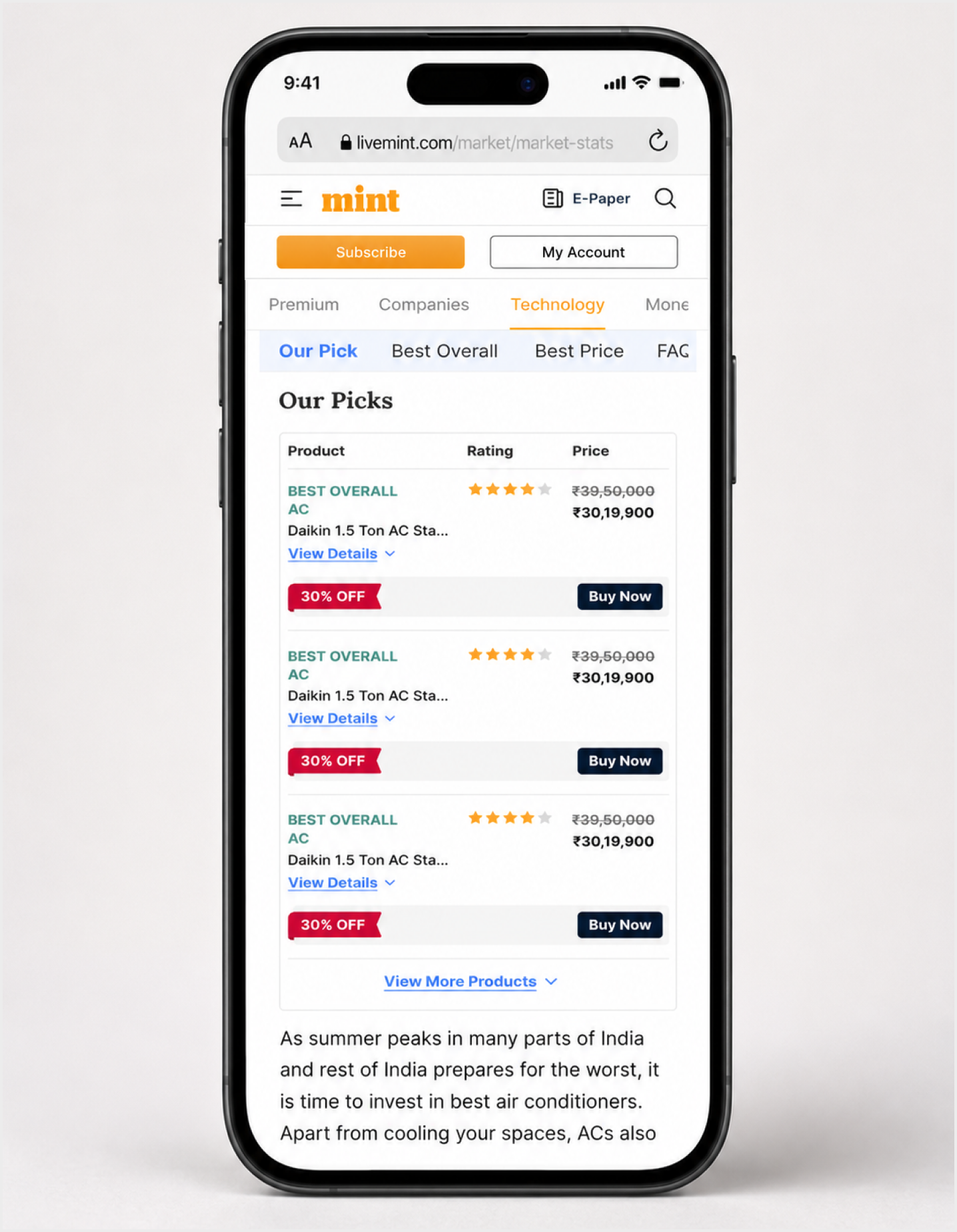
A compact comparison layer surfaces price, rating and key distinctions before readers commit to long product descriptions.
Reveal details progressively
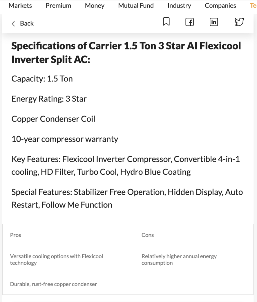
Specifications, pros and cons stay available without overwhelming the first scan, while CTAs remain close to the decision point.
Trust Tags to navigate users directly
Product card in the comparison table
Reasons to buy
Reasons to avoid
“click here to buy” CTA the after the product details so that users don’t have to scroll back on the top
Final Experience
Recommendation first. Comparison second. Detail when needed.
The final system establishes a clearer hierarchy from article introduction to recommendation, comparison and product detail. Trust tags create fast entry points, comparison rows make trade-offs visible, and product sections combine specifications, reasons to buy or avoid, and purchase actions in one decision context.
Status
Designed for launch. Impact to be assessed post go-live.
The redesign was documented before launch, so I am not claiming performance improvements that were not yet measured. The intended success criteria were clearer search discoverability, stronger engagement with comparison content, better affiliate click-through and a more usable path from editorial content to purchase.
Discoverability
Can readers and search engines understand the structure of the page more easily?
Decision behaviour
Do readers use trust tags, comparison rows and progressive detail to move through the page?
Affiliate action
Do purchase CTAs receive stronger interaction once they appear closer to the decision context?
Takeaway
For commercial editorial pages, clarity is part of conversion.
Readers should understand what is recommended, why it is recommended and how the options differ before they are asked to buy.