Making a new way of working clear enough to earn 100+ early signups.
NAVAA · LANDING PAGE + WAITLIST EXPERIENCE · FOUNDER-LED · 2026
Navaa is a work-management tool for founders, integrated with WhatsApp. Before the app is ready to ship, I needed to test whether the problem and positioning could attract real early interest. I designed the waitlist as the first product interaction: a low-friction sign-up followed by a personalised launch ticket.
WHAT IT ACHIEVED
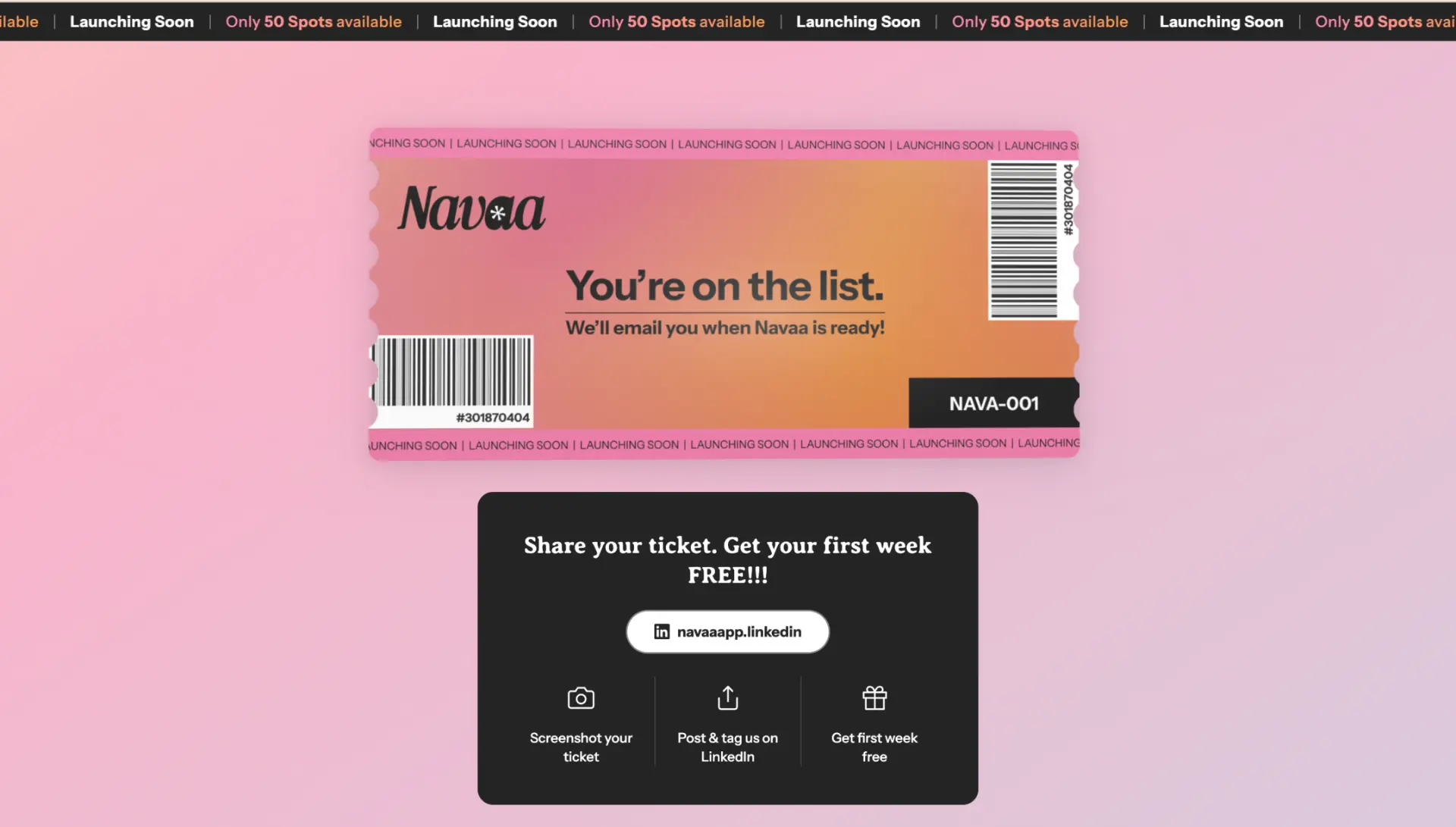
100+ early signups before launch, with the confirmation moment turned into the first real product experience through a personalised launch ticket.
Landing Page Strategy
Sell a new behaviour without adding a new habit.
Keep WhatsApp familiar. Make the automation understandable. Remove switching anxiety.
Make the pain recognisable
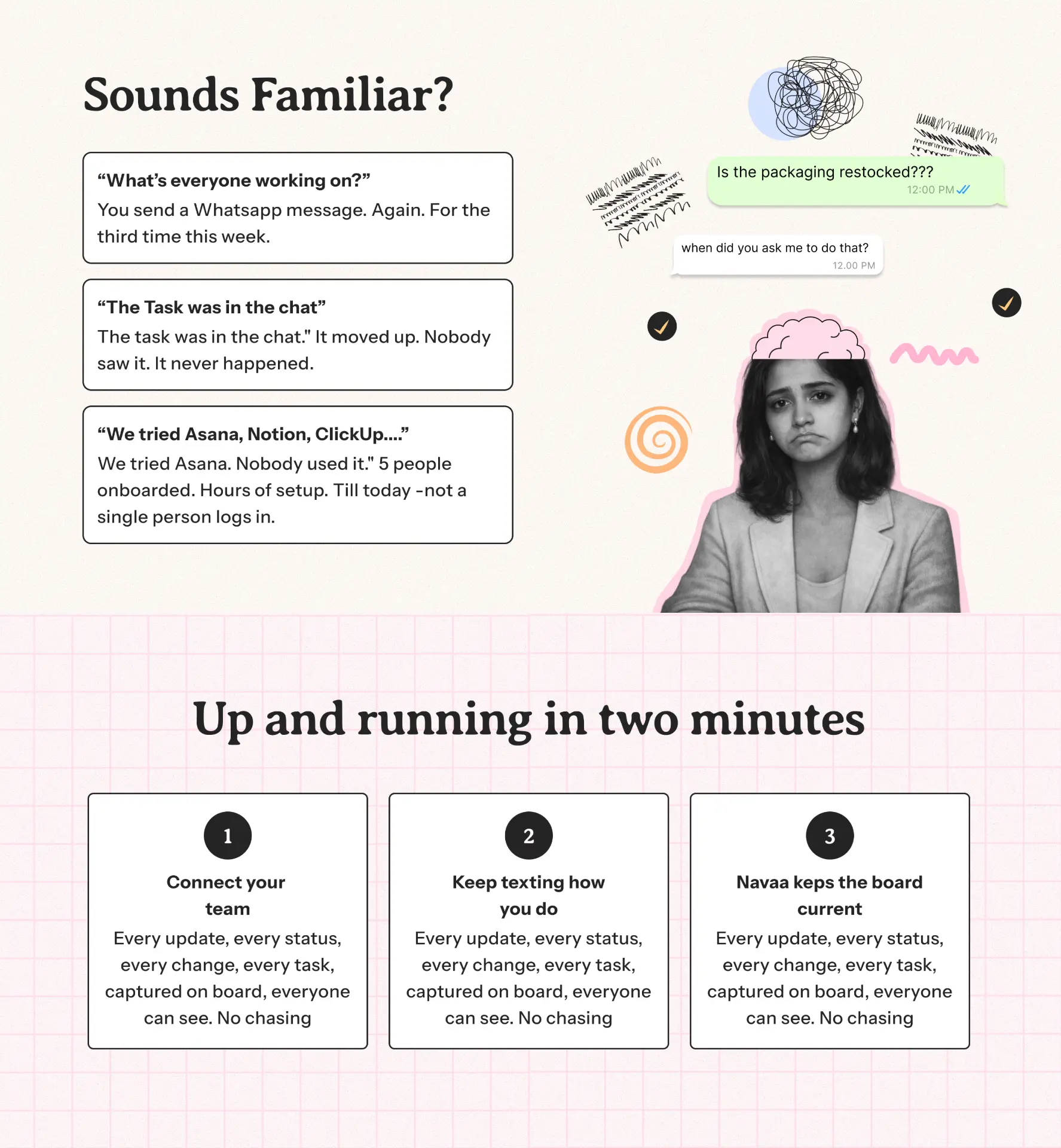
Lead with familiar coordination pain.
Explain the mechanism simply
Explain the behaviour, not a feature list.
Reduce switching anxiety
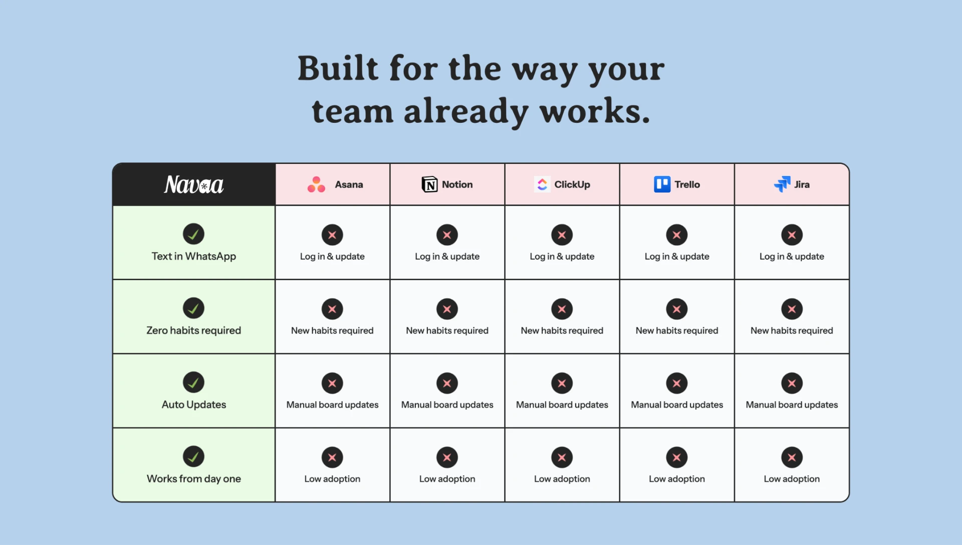
Compare habits, not checklists.
| Navaa | Typical PM tool | |
|---|---|---|
| Where work lives | Open another app | |
| Habit change | Zero new habits | New tool to learn |
| Updates | Through WhatsApp chats | Manual updates |
Conversion Architecture
Clarity first. Reassurance second. Commitment last.
Persuasion sequence, not feature catalogue.
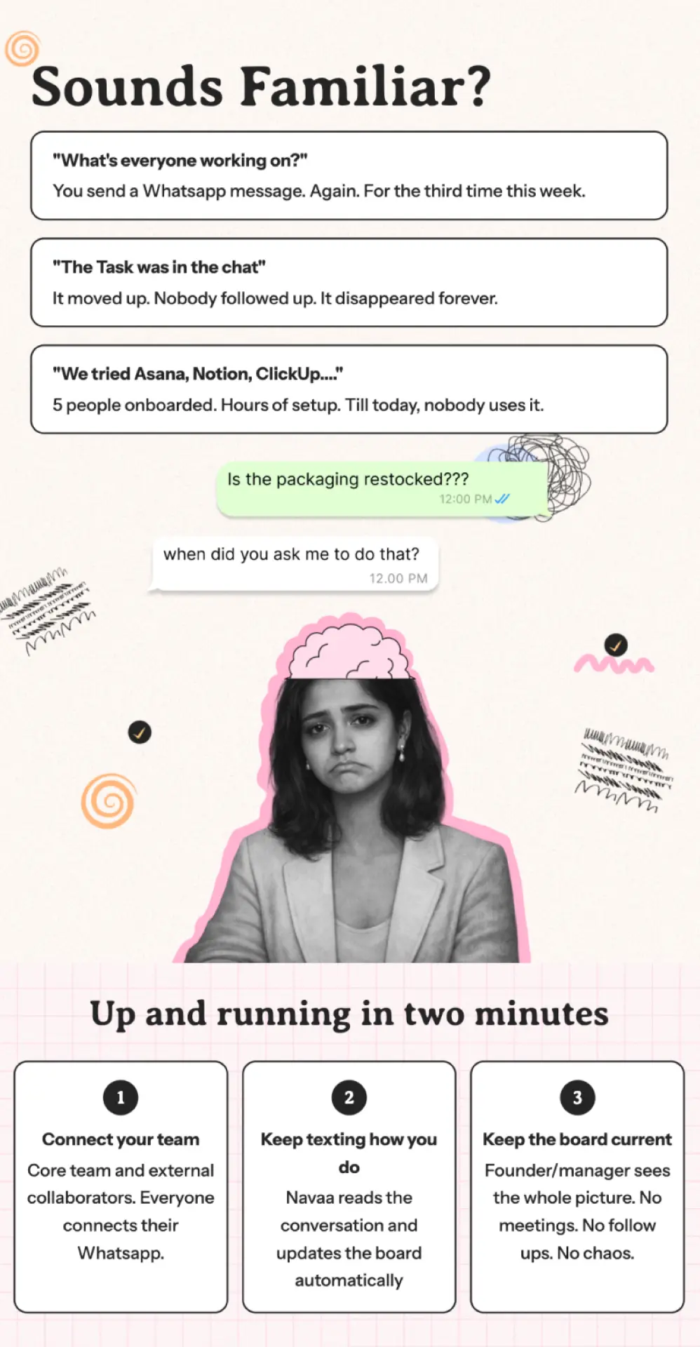
Use familiar pain to make the visitor feel understood before introducing the product.
Show the mechanism, two-minute setup and behavioural comparison to reduce perceived switching cost.
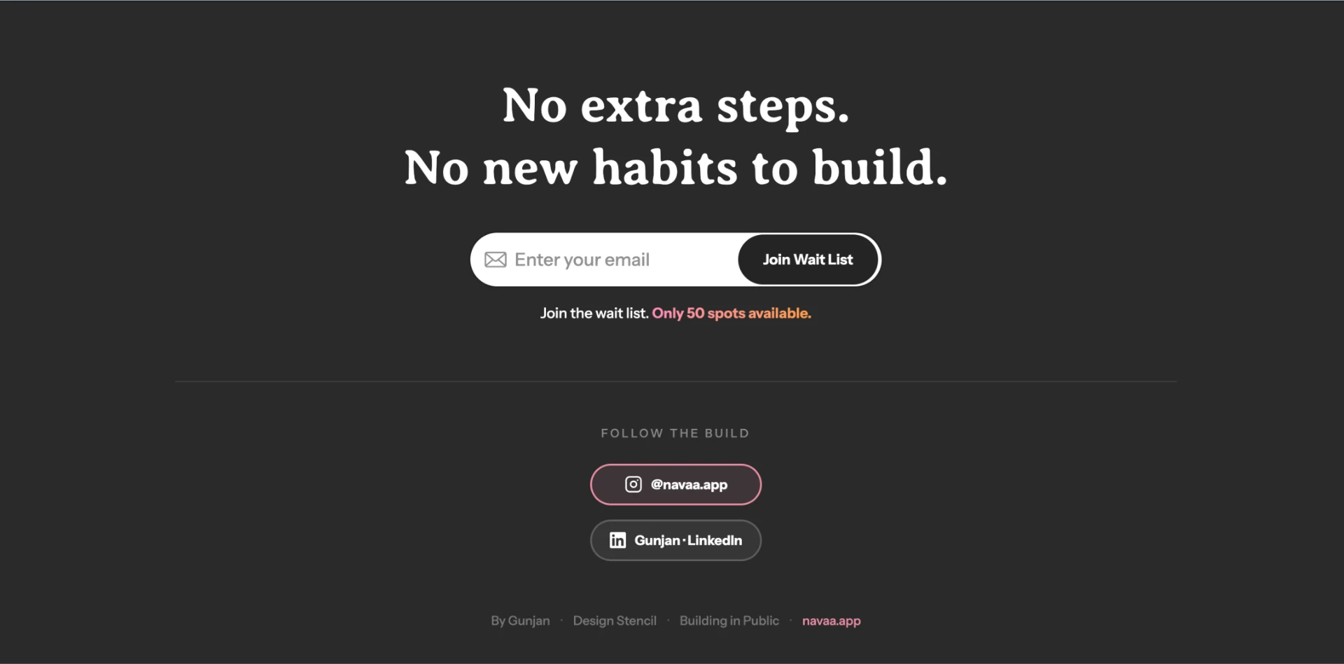
Repeat the CTA. Then reward completion.
WHAT IT PROVED
100+ signups came from the full story, not a single clever confirmation screen. The page earned the signup. The ticket made it memorable.
Landing Page Architecture
Recognition first. Reassurance next. CTA last.
Each section answered one question, then moved the user forward.
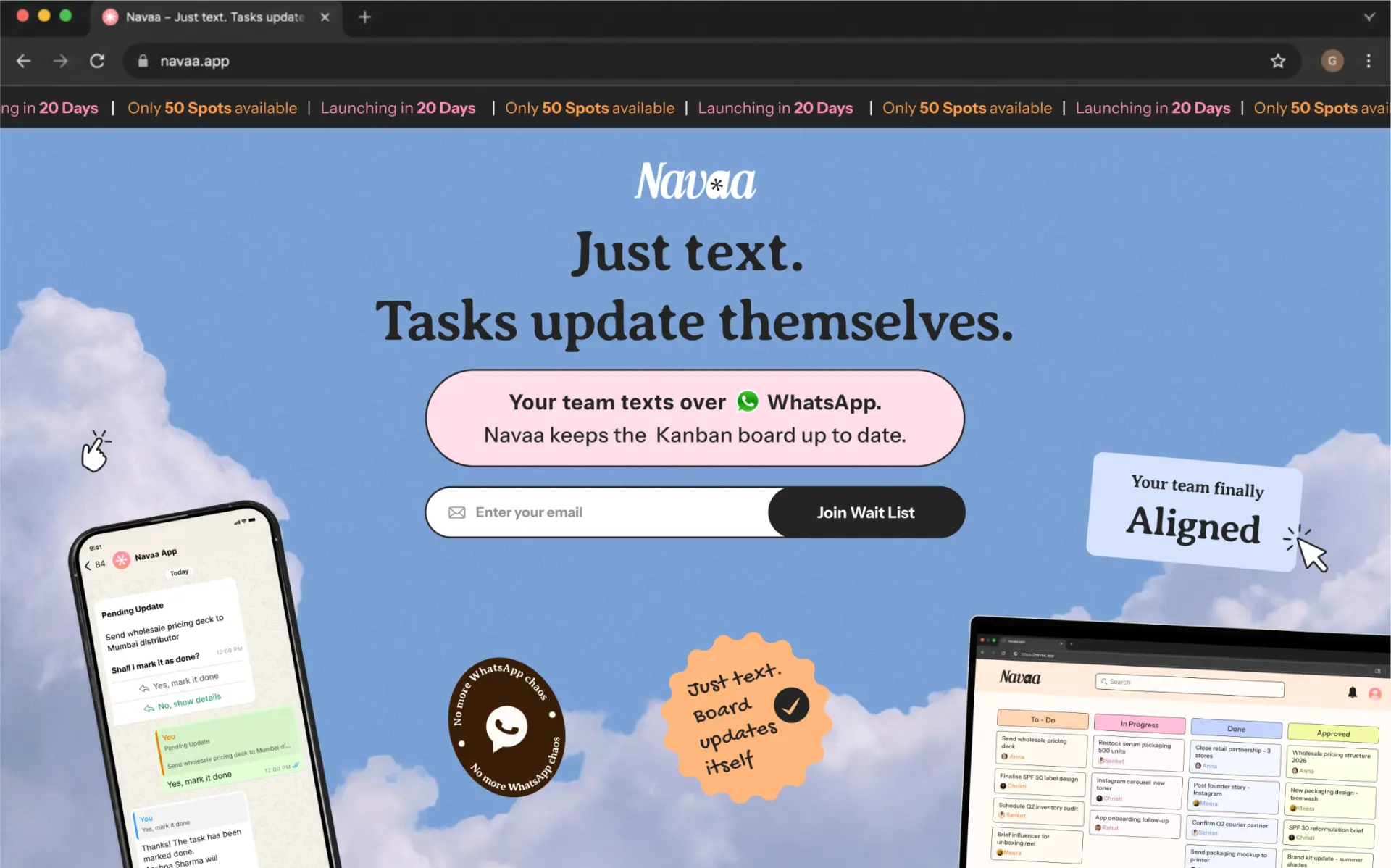
Promise in one sentence
One sentence + one action.
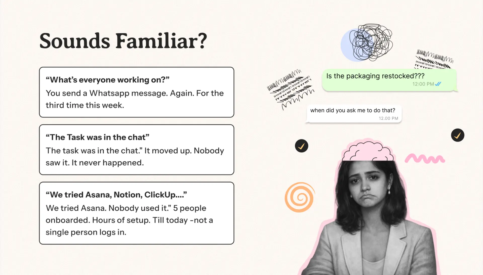
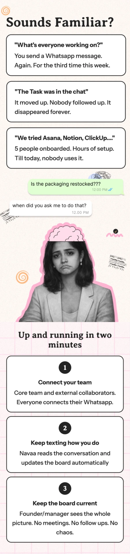
Sounds familiar?
Make the pain feel familiar.
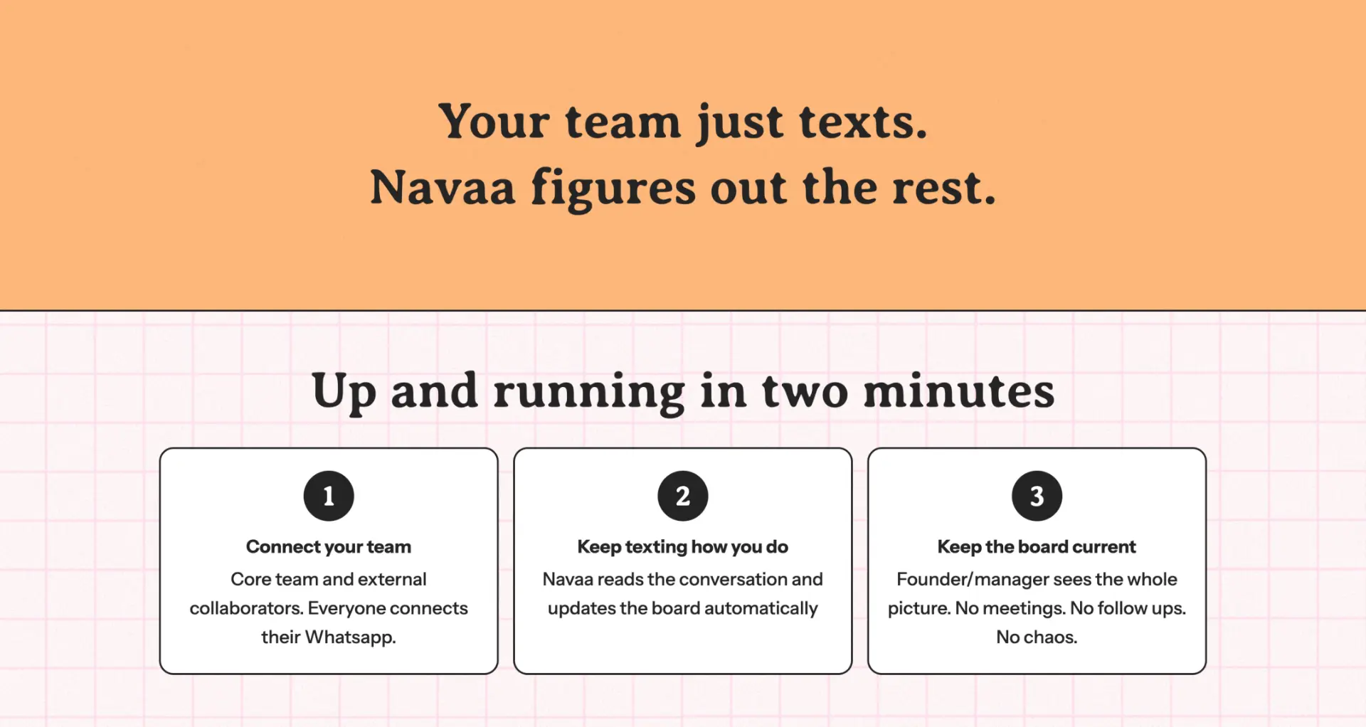
Your team just texts. Set up in two minutes.
Three steps. Low setup cost.
Compare habits, not checklists.
Frame alternatives around behaviour.
Joining to personalised ticket
CTA → confirmation → ticket.
Responsive Design
Responsive by hierarchy, not by scaling.
Kept the same conversion story at every width, then re-authored composition, density and interaction for the space available.
1. Preserve reading order
The narrative stays Hero → Problem → Mechanism → Proof → CTA even when columns collapse.
2. Recompose, don’t shrink
Device art and ticket visuals move around the copy instead of being proportionally squeezed.
3. Design for touch
Primary actions stay easy to reach, and no important meaning depends on hover.
1. COPYCTAVISUAL
The value and waitlist action arrive before decorative product imagery.
2. GRIDSSTACKS
Comparison and explanation cards become one clean vertical reading path.
3. TICKETTOUCH SAFE
The launch ticket remains readable and complete without hover-only information.
4. DENSITYPROGRESSIVE
Secondary detail moves later so the first screen stays focused on comprehension + signup.
A waitlist is a product surface. The page had to earn the signup, and the ticket had to make that signup feel like the first good thing Navaa ever did for you.