Turning a long search page into a clear hiring decision.

SEKERON · SEARCH-TO-HIRE LANDING PAGE · 2026

Landing Page UXInformation ArchitectureResponsive Design

A scalable category × city landing-page system for people arriving with a specific hiring intent for example, photographers in Delhi and needing to move from search to trust to action without reading a wall of copy.
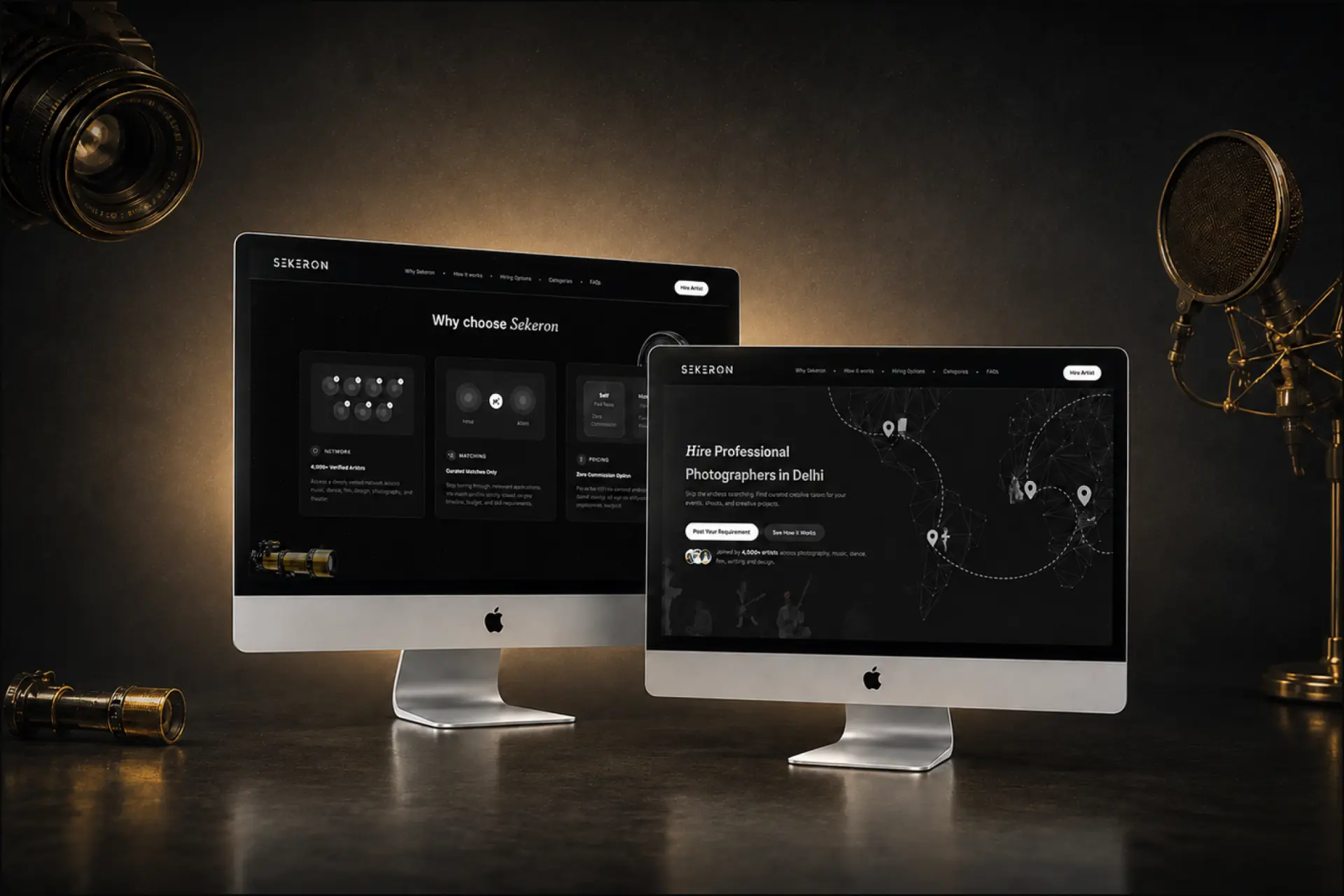
Sekeron search-to-hire landing page collage
View live

The Design Tension

One page. Three competing jobs.

The page had to serve search intent, make an unfamiliar hiring model understandable, and still feel unmistakably Sekeron. The job was not to make the page shorter. It was to make the decision feel shorter.

01SearchBe specific enough to match category + city intent.
02DecisionMake trust, process and pricing easy to compare.
03BrandAvoid turning a creative platform into a generic service page.
The page had to answer in this order:Is this relevant? Can I trust it? How do I hire?

User Flow

Page structure around the hiring decision - not the SEO brief.

Each section answers the next question a hirer is likely to have, so depth arrives only when it becomes useful.

  1. 01Search IntentHire [artist] in [city]
  2. 02ProblemWhy is this hard today?
  3. 03TrustWhy should I trust this?
  4. 04ProcessWhat happens next?
  5. 05ChoiceWhich hiring model fits me?
  6. 06ExploreCan this handle my project?
  7. 07ClarifyWhat might stop me?
  8. 08ActI’m ready - what do I do?
IA PrincipleRelevance confidence understanding choice action. 

First-Screen Strategy

The hero does four jobs before the user scrolls.

The opening composition was designed as a compact decision surface, not a decorative banner.

Sekeron landing page hero composition
01RelevanceCategory + city match the search intent immediately.
02PromiseCurated talent replaces “endless searching”.
03ActionCTAs support ready-to-hire and exploratory users.
04Proof4,000+ artists reduces uncertainty before scroll.

Problem Framing

Translate scattered hiring into a visible alternative.

Instead of explaining Sekeron abstractly, the page first names the behaviour users already recognise - scattered portfolios, WhatsApp forwards and Instagram DMs - then shows a simpler route.

Current BehaviourFinding artists shouldn’t be this complicated.
Scattered portfoliosWhatsApp forwardsInstagram DMsUnclear availabilitySlow responses
The Sekeron WayTell us what you need. Surface relevant talent.
Singers in MumbaiGuitarists in PuneSitar Players in LondonKathak Dancers in KarnatakaPainters in SingaporeCinematographers in New York
Design MoveMake the value proposition concrete by contrasting the existing workaround with the new workflow.

The Design Tension

Trust is built before price appears.

The “Why choose Sekeron” section turns broad brand claims into three decision-relevant proofs.

Verified artist network checks
Network4,000+ Verified ArtistsAccess a deeply vetted network across music, dance, film, design, photography, and theater.
Curated matching visual
MatchingCurated Matches OnlyStop sorting through irrelevant applications. We match profiles strictly based on your timeline, budget, and skill requirements.
Pricing sparkle
PricingNo-Commission OptionPay a flat ₹199 to connect and finalize with talent directly, or opt for full project management support.

Decision Support

Make the process legible then make the commercial model comparable.
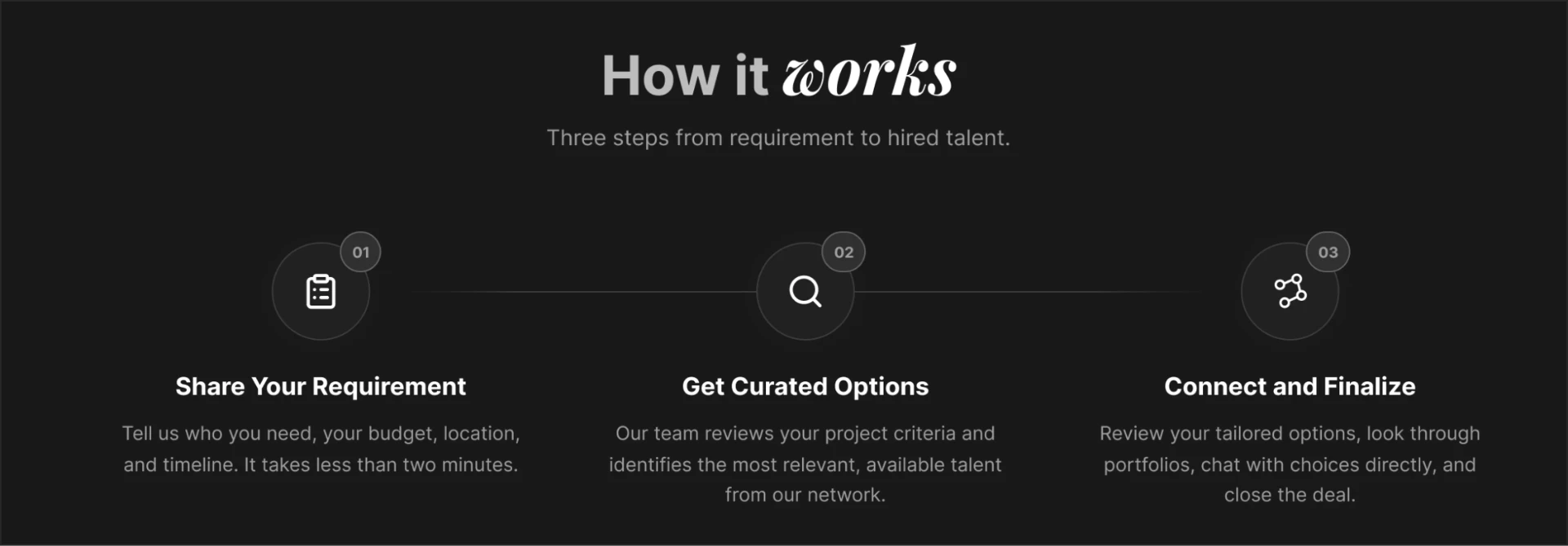
Three-step hiring process on the Sekeron landing page
First Make The Workflow VisibleThree steps turn an unfamiliar service into a predictable sequence: share the requirement, receive curated options, connect and finalise.
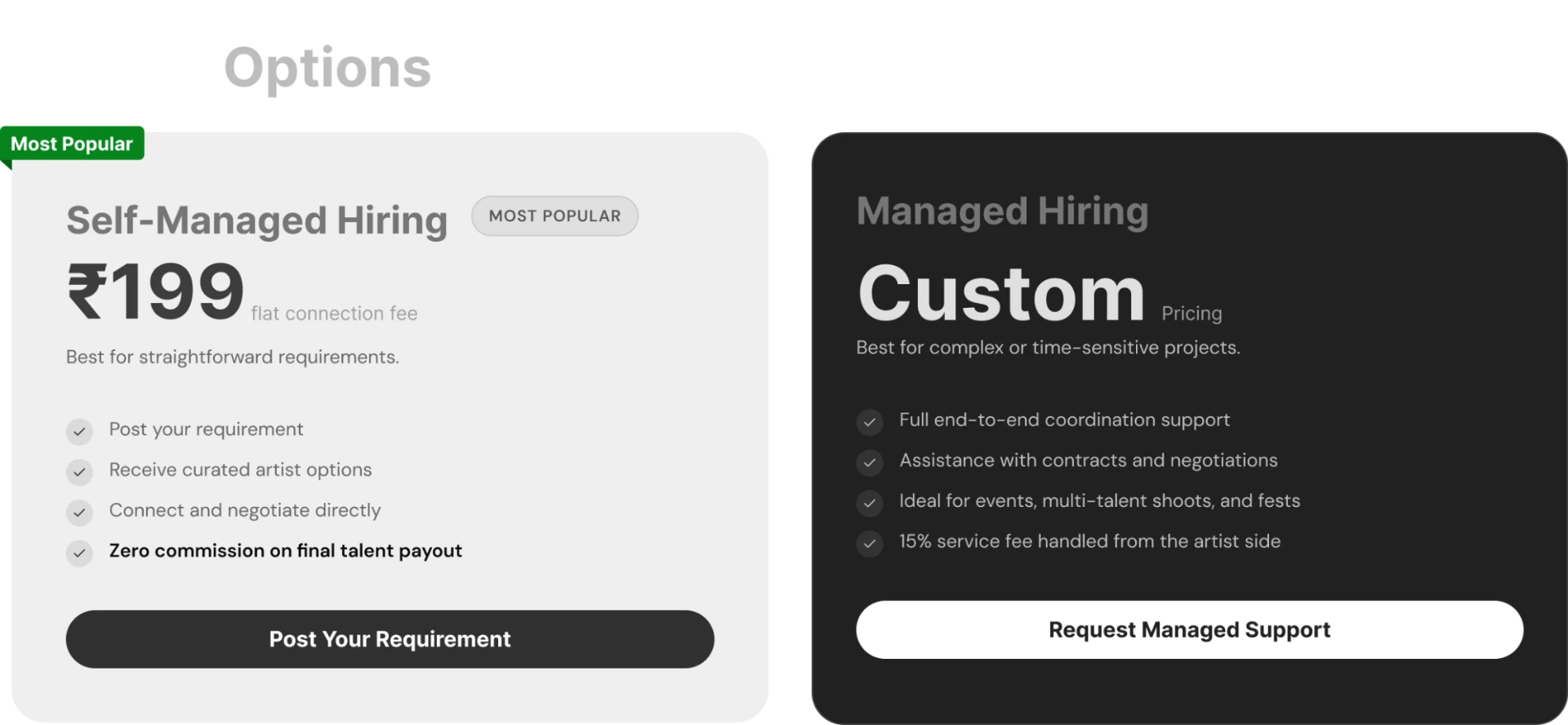
Side-by-side pricing comparison on the Sekeron landing page
Design PrincipleProcess reduces uncertainty. Side-by-side pricing supports an actual choice instead of burying the commercial model in copy.

Breadth Without Directory Dump

Show range without turning the page into a directory.

Sekeron spans categories, cities and project sizes. I used controlled discovery blocks to demonstrate breadth without forcing users through an exhaustive catalogue.
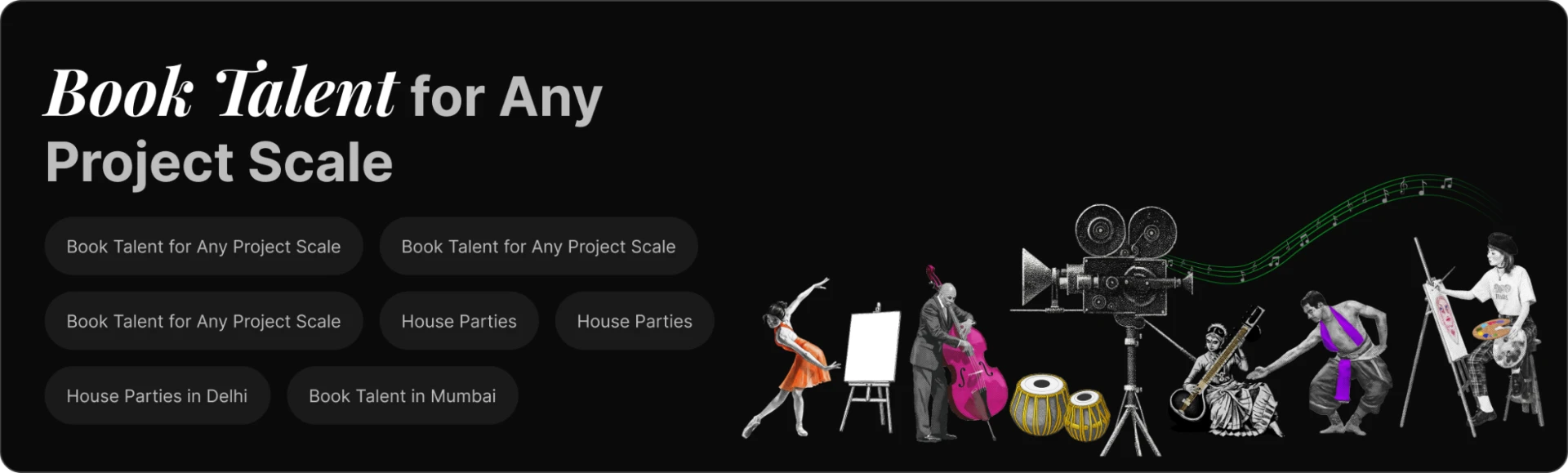
Book talent for any project scale

Project scale answers “Can Sekeron handle my use case?”
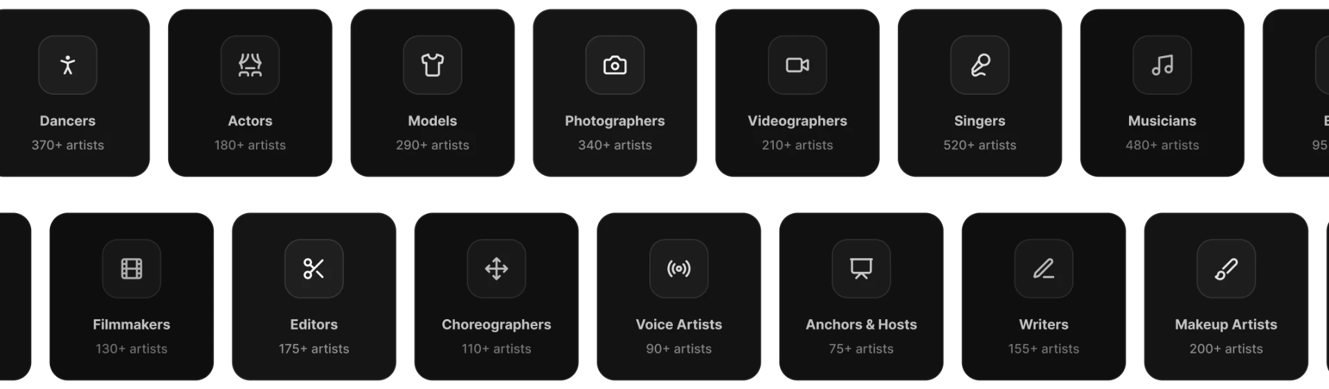
Artist category grid on the Sekeron landing page
Content DescisionBreadth is shown after trust, process and pricing when users are ready to explore, not before they understand the proposition.

Objection Handling

Resolve doubts at the point where hesitation appears.

The FAQ is not filler at the bottom of the page. It closes the remaining decision gaps, agency model, pricing, location, response time before the final conversion ask.
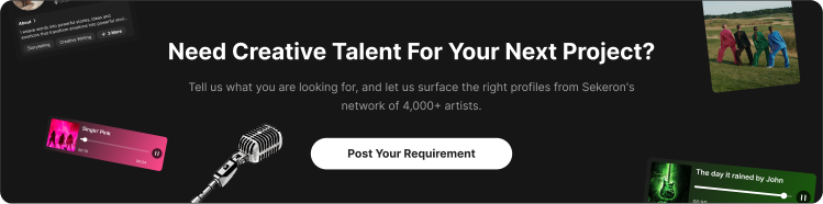
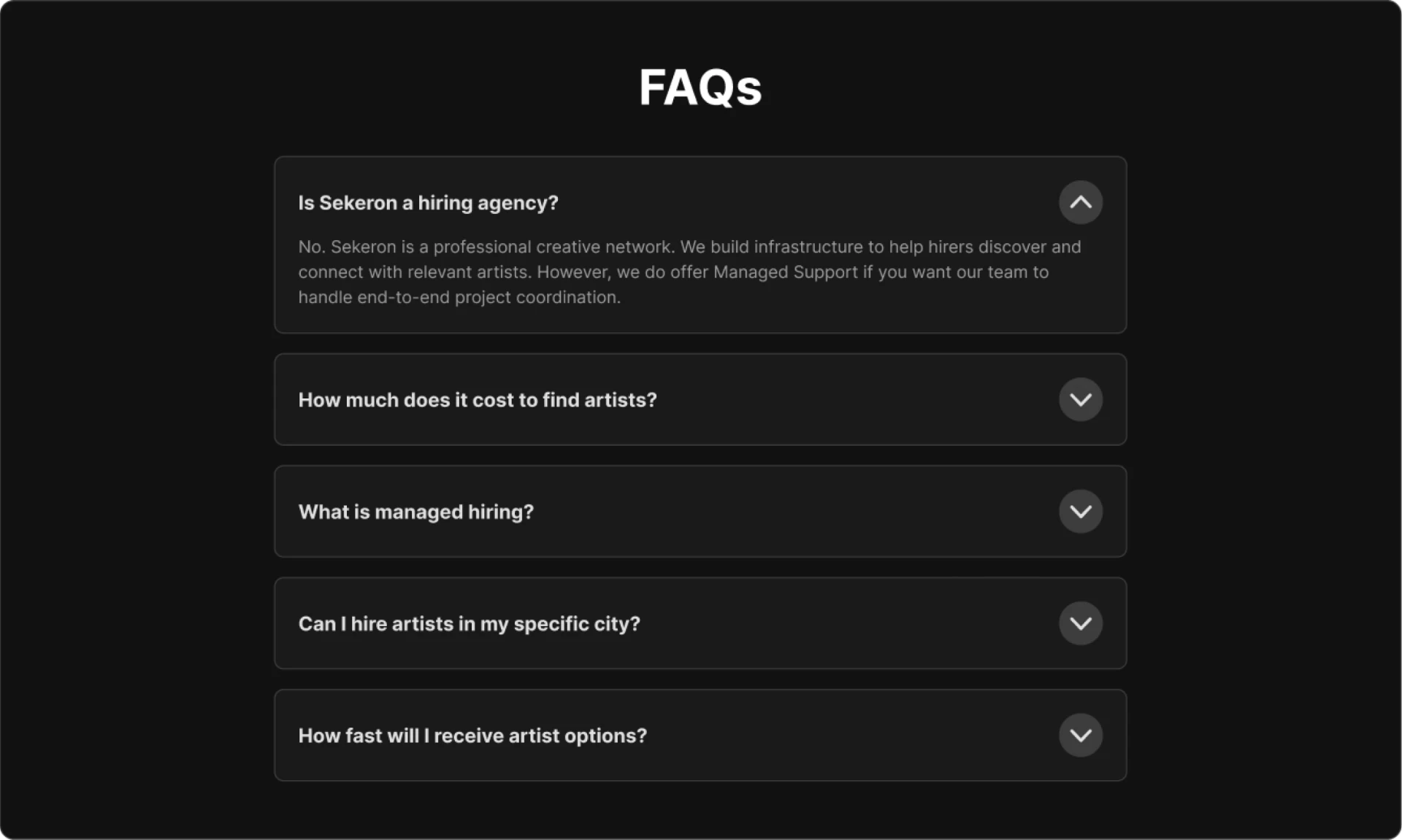
FAQ block resolving remaining objectionsFAQs section of the Sekeron landing page
SequenceAnswer uncertainty first. Ask for commitment second.

Responsive Composition

Same hierarchy. Different composition.

The responsive system preserves the decision sequence while changing what can sit side-by-side. The mobile experience is re-authored for one clear reading path rather than scaled down from desktop.
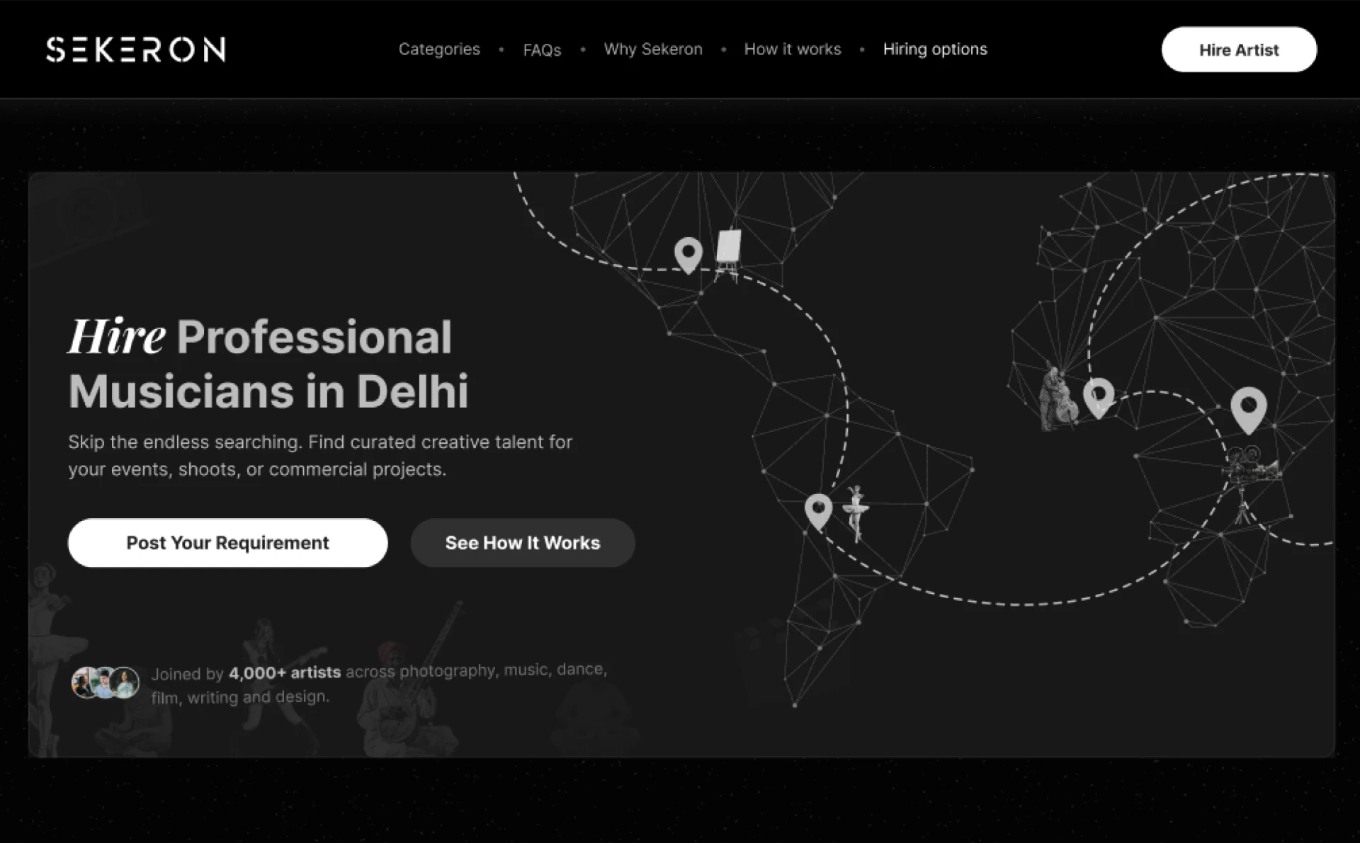
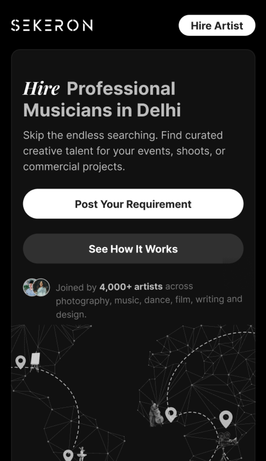
Web · 1280
Sekeron landing page on desktop
Parallel scanningHero copy and visual proof can share the viewport; comparisons remain side-by-side where the screen supports them.
MWeb · 360
Sekeron landing page on mobile web
Single reading pathSections stack by decision priority; primary action, trust and pricing stay close to the moment they become relevant.
01Reorder, don't shrinkSide-by-side relationships become an intentional sequence.
02Collapse ComparisonCards stack without losing the comparison logic.
03Keep Action CloseThe primary CTA stays near the intent it answers.
Responsive VisiblePreserve the hierarchy. Recompose the relationships.

Outcome

The job was not to make a long page short. It was to make a long hiring decision feel shorter.

The final system turns category × city search intent into a guided sequence of relevance, trust, process, choice and action — while keeping Sekeron’s creative identity intact.

01Search RelevanceThe first screen confirms intent immediately.
02Trust ChoiceProof and process appear before pricing decisions.
03Breadth ControlRange is revealed after orientation, not upfront.

Bring me the version that is still unclear.

The half-formed idea, tangled user journey or product that works but still doesn’t feel resolved