SEKERON · ARTIST ONBOARDING
Introduce the creative world before asking users to describe themselves.
The previous flow opened with profile fields. The redesign lets artists first experience what Sekeron is for discovering people, networking, collaborating and managing creative work, then collects identity and preferences progressively.
Before After
From data-first onboarding to value-first onboarding.
The redesign does not simply restyle the old flow. It changes the order in which Sekeron asks for commitment.
Profile first
Users were asked to identify themselves before the product had shown why that information mattered.
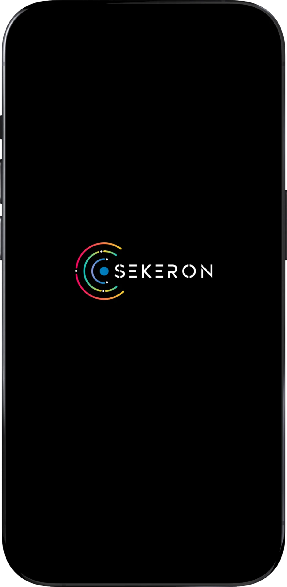
Before: The Splash screen borrowed too many colours directly from the logo, which made the brand feel visually busy and reduced hierarchy across the screen.
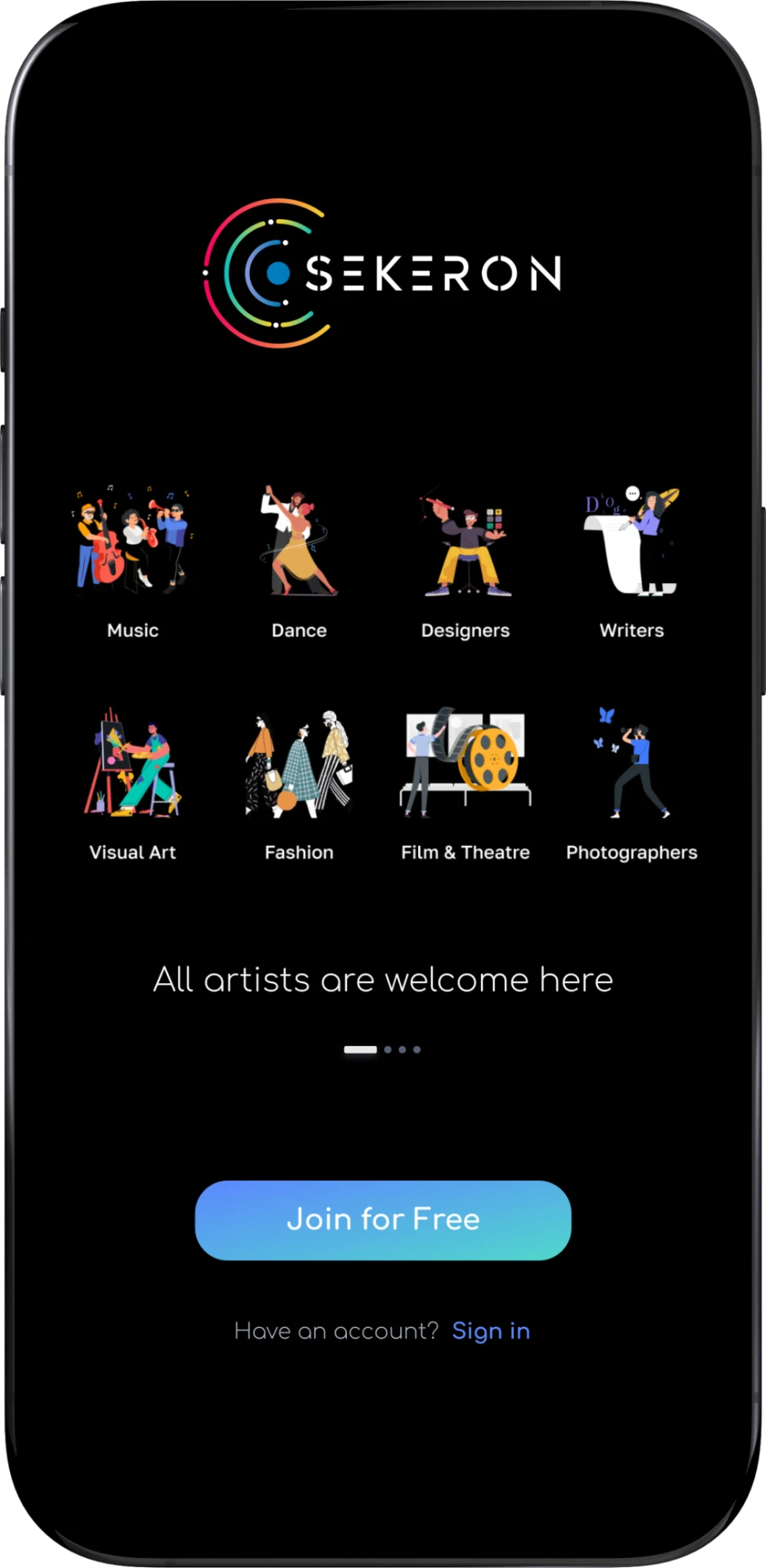
Before: The screen was largely static and moved users into onboarding without communicating what they could actually do on Sekeron. It had too many competing elements and weak visual hierarchy.
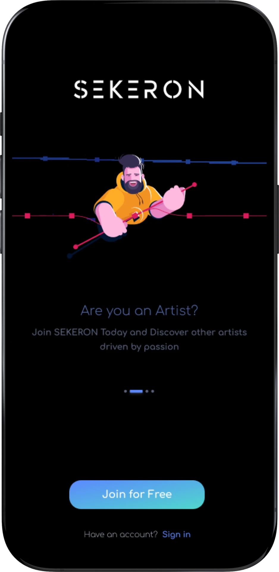
Before: The steps rely on a generic illustration and standard form treatment. The visual could belong to almost any social app - it adds decoration, but doesn’t communicate Sekeron’s artist-focused world or give the user a reason to care about the information being requested.
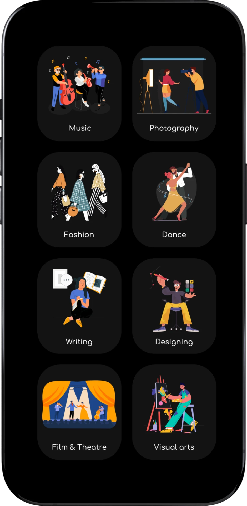
Before: The screen communicates different creative disciplines through generic illustration cards - Music, Photography, Fashion, Dance, Writing, Designing, Film & Theatre and Visual Arts. The categories are understandable, but the stock-style visuals make Sekeron feel like a generic creative platform rather than a real artist community. with no indication on next step
Intro before onboarding
Artists first see what Sekeron enables, then progressively build the profile needed to participate in it.
After: Simplified the palette and refined the brand expression, using colour more selectively. This keeps Sekeron’s original personality intact.
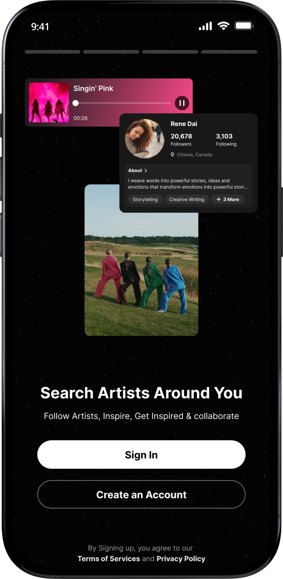
After: Introduced subtle motion and product-led visuals - discovering artists, sharing work, finding collaborations, and building an artist profile. This makes the onboarding feel more engaging while communicating the product’s value.
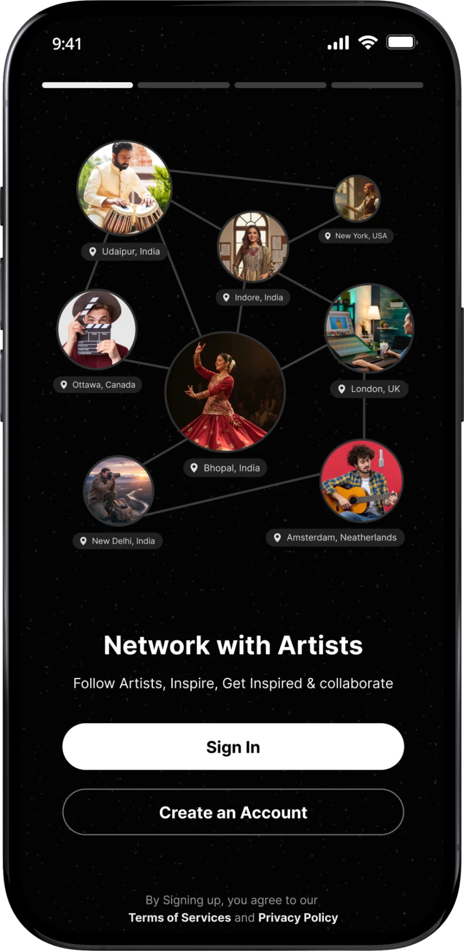
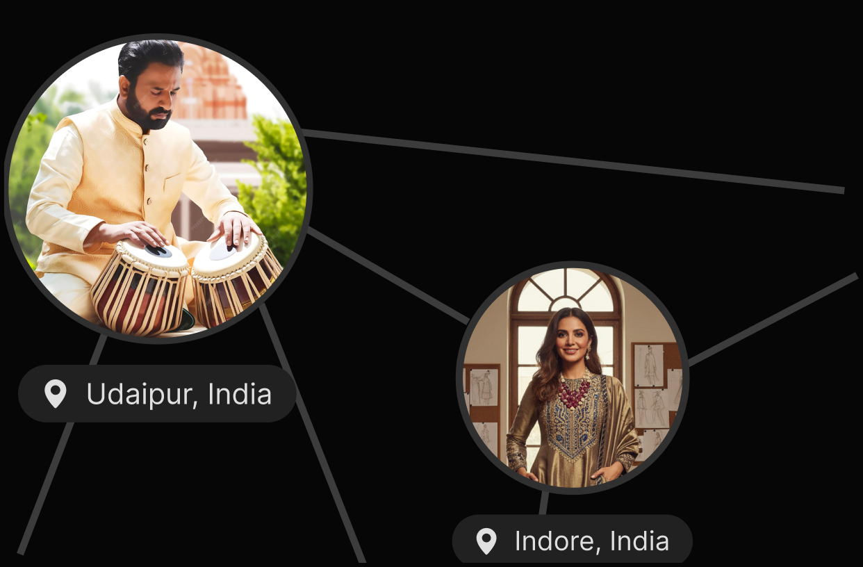
After: The same profile step is framed with a more distinctive, artist-led visual language and clearer content hierarchy. The imagery now reinforces the creative community users are joining, so the screen feels connected to Sekeron’s product and brand rather than like a generic signup form.
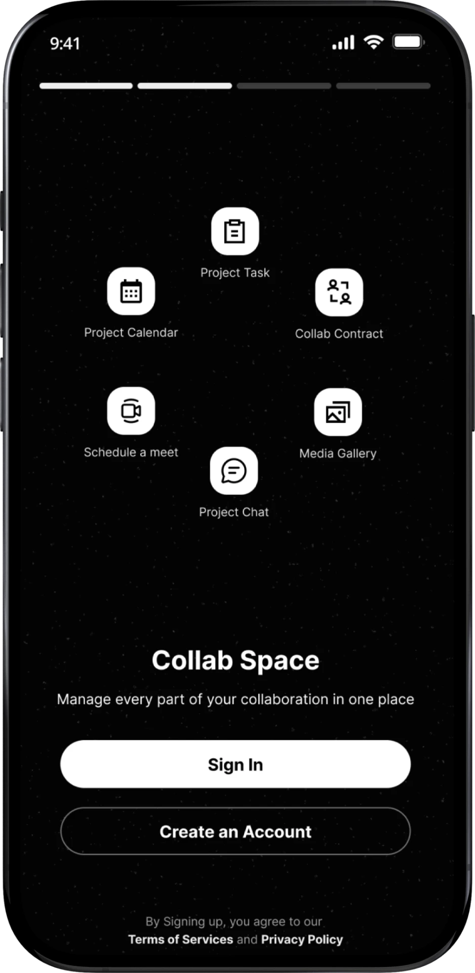
After: Introduced Collab Space during onboarding itself, showing Project Tasks, Calendar, Contracts, Meetings, Chat and Media Gallery as one connected workspace. This communicates a stronger product value upfront: Sekeron doesn’t just help artists discover collaborators, it also gives them the tools to actually manage the collaboration from start to finish.
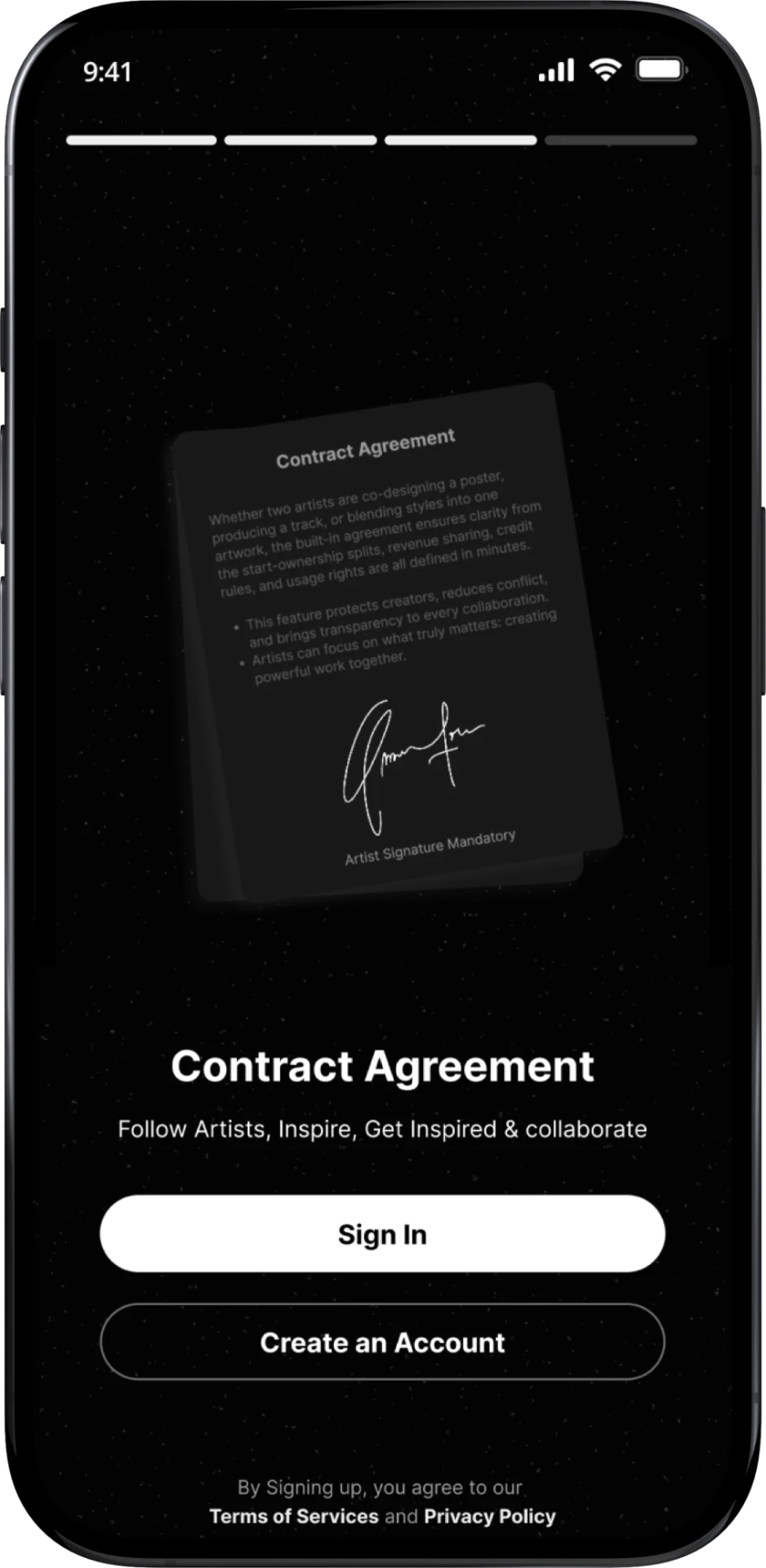
After: “Contract Agreement” closes the tour by showing trust and structure in collaborations — a capability the previous flow never surfaced before asking for commitment.
Flow Logic
The redesign changes the order of commitment.
More steps are not automatically more friction. Each step now asks for less, arrives with more context, and keeps the next decision obvious.
Art Direction
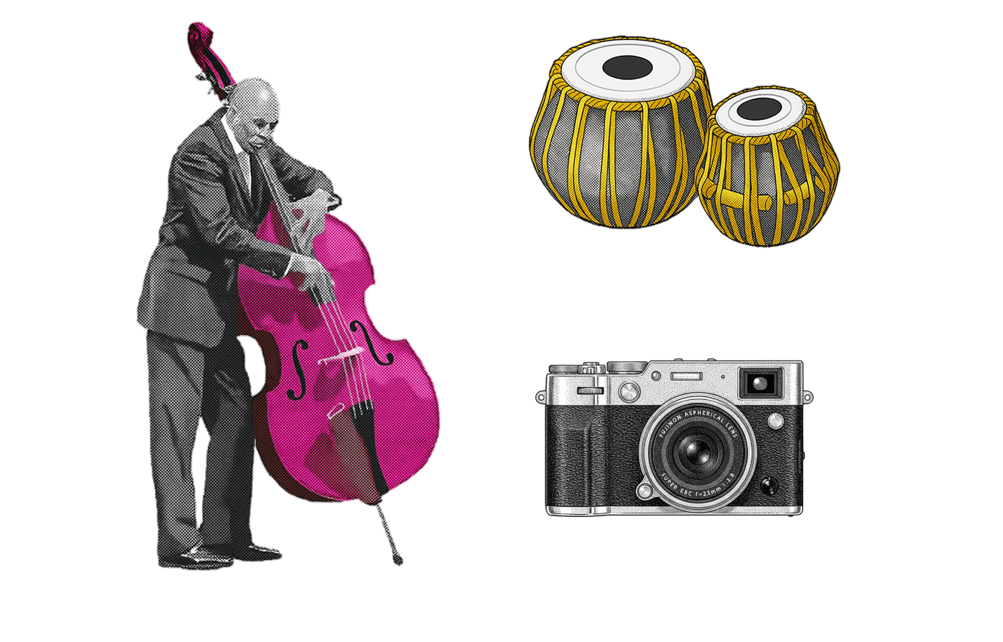
A visual system made for creators, not a generic dark UI.
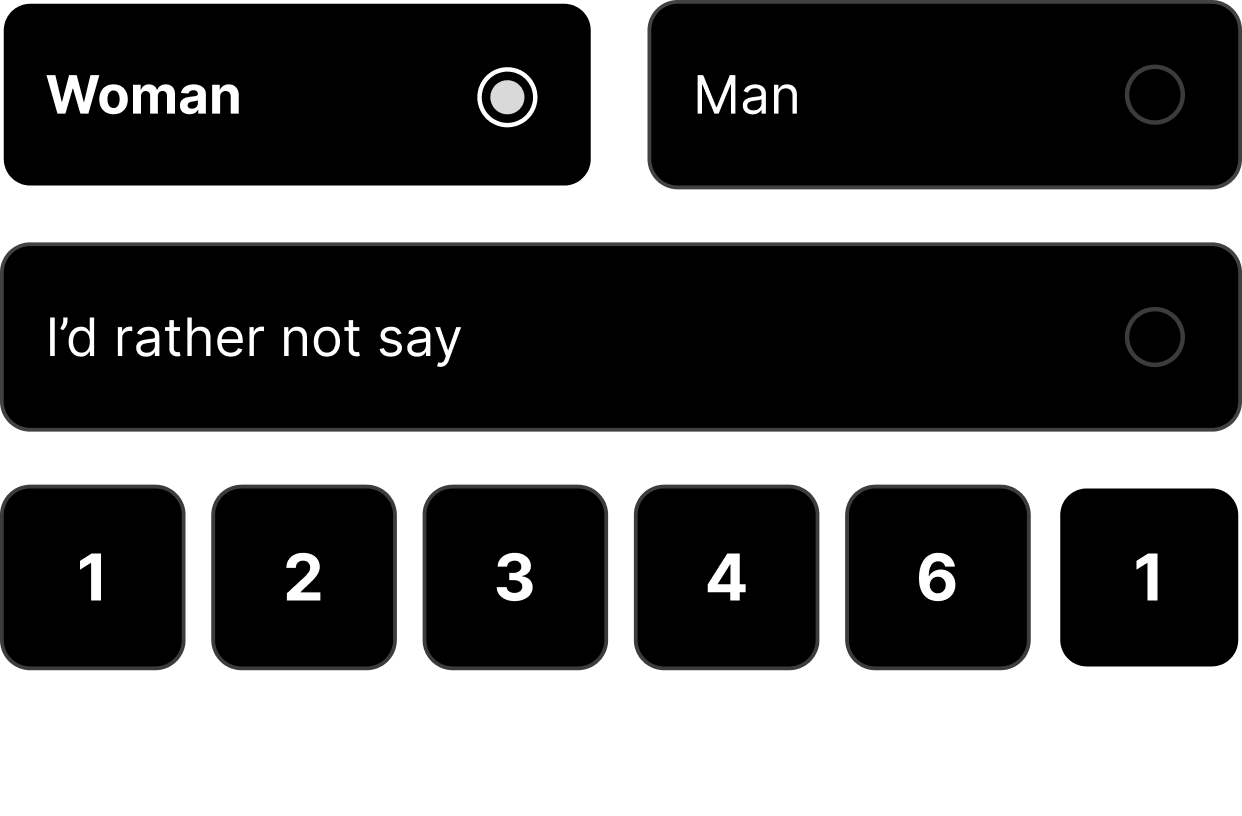
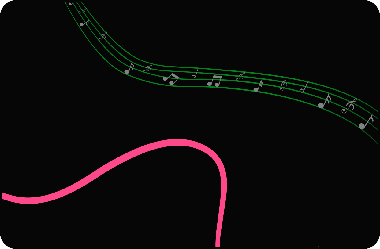
Rather than repeating whole onboarding screens, this section breaks Sekeron into the visual ingredients that recur across the experience.

UX COMPARISON
Same product goal. Different onboarding philosophy.
The comparison below focuses on interaction structure rather than visual polish alone.
| DESIGN DIMENSION | PREVIOUS | REDESIGNED |
|---|---|---|
| Entry point | Identity & account fields | Product-world preview |
| Information density | Several fields per screen | One primary decision per step |
| Value communication | Mostly implicit | Search, network, collaboration, contracts |
| Brand experience | Generic form treatment | Art-directed, creator-specific experience |
| Personalisation | Skills and interests grouped late | Skills, location, category and intent progressively |
| Mental model | “Complete my profile” | “Enter this creative community” |
Interaction Design
The flow makes progress feel lighter than the amount of information collected.
Progress stays visible
The dot indicator keeps orientation without turning the flow into a numbered checklist.
One dominant action
Each screen ends with one obvious next step; secondary choices stay visually quiet.
Selections feel tangible
Skills, categories and intent use chips/cards/radio states so completion is visible at the point of action.
Brand carries through forms
Illustration and dark visual direction remain present even when the flow becomes utilitarian.

Onboarding became the first expression of the community - not just the gateway into it.
The redesign introduces Sekeron’s value and creative tone before progressively asking users to build the profile that makes participation useful.