Turning a daily login reward into a small ritual worth returning for.
YRAL APP · DAILY LOGIN REWARDS · 2025
Yral needed a lightweight daily reward loop that could sit inside the product without feeling like a separate game. I designed the experience from seeing today’s reward, claiming it and entering Scratch & Win, to understanding the result and the next available action.
CLIENT REQUIREMENT
Make today’s reward obvious, give the claim moment enough delight to feel intentional, and return the user to the product without unnecessary friction.
The Brief
The reward calendar had to make one thing obvious: what can I claim today?
The concept combined a Daily Login Rewards grid with a Scratch & Win moment. The interaction challenge was to make today’s state easy to find and to separate collected from upcoming rewards.
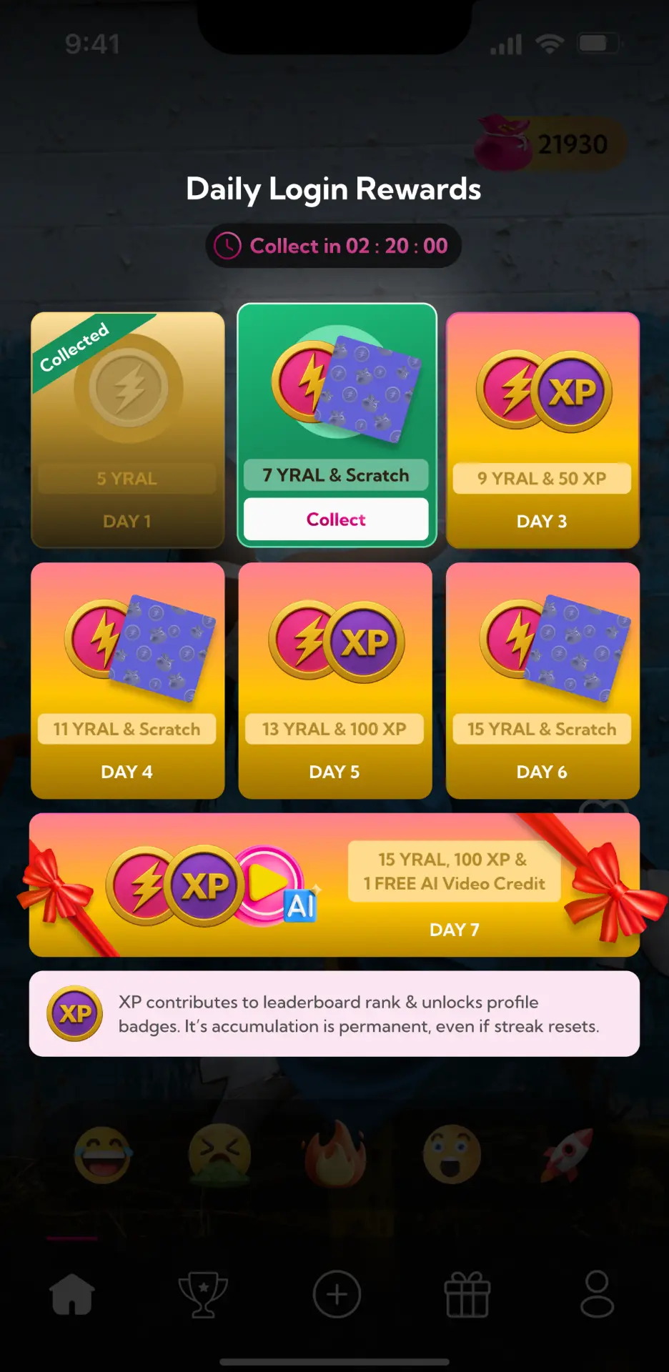
Find today instantly
The active day and claim action need stronger priority than the rest of the reward calendar.
Make status unmistakable
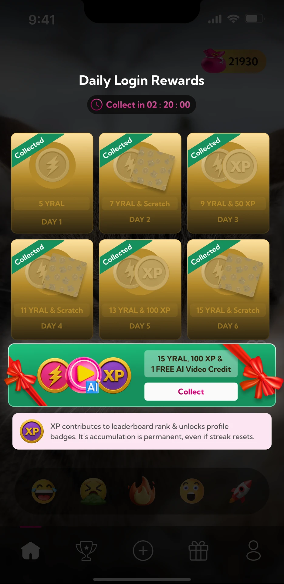
Claimed, available and upcoming rewards should read differently without needing explanation.
Keep delight brief
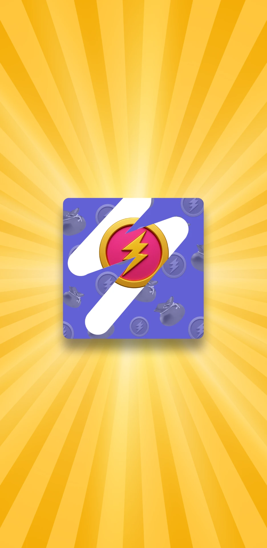
Collect / Scratch & Win creates the reward moment, then hands the user back to the game
Daily Reward Loop
The loop was short: open locate today claim scratch return.
The calendar carries the logic; the scratch card carries the delight. Each step has one job, so the user never has to decode reward rules while trying to claim.
Scratch Interaction & Motion
The scratch interaction reduced three kinds of friction: precision, waiting and choice.
Instead of treating scratching as decoration, I designed it as the primary control. The target is generous, the interface responds at the point of touch, and secondary actions stay quiet until the reward has resolved.
Remove precision
The scratch card behaves as one large target. Users can begin anywhere on the surface instead of acquiring a tiny handle or exact start point.
Design consequence: the whole card is interactive.
Remove waiting
The surface acknowledges input as the gesture begins. Visual change stays attached to the finger so the system never feels one step behind the user.
Design consequence: feedback begins at touch.
Remove competing choices
During the scratch, the interface asks for one action only. Reward details and the next CTA become prominent after the reveal is complete.
Design consequence: choice follows closure.
Interaction State System
The reward calendar explained itself through state changes, not extra screens.
The same reward tile changes emphasis, action and guidance as it moves from upcoming → available → collected.
Deactivated card
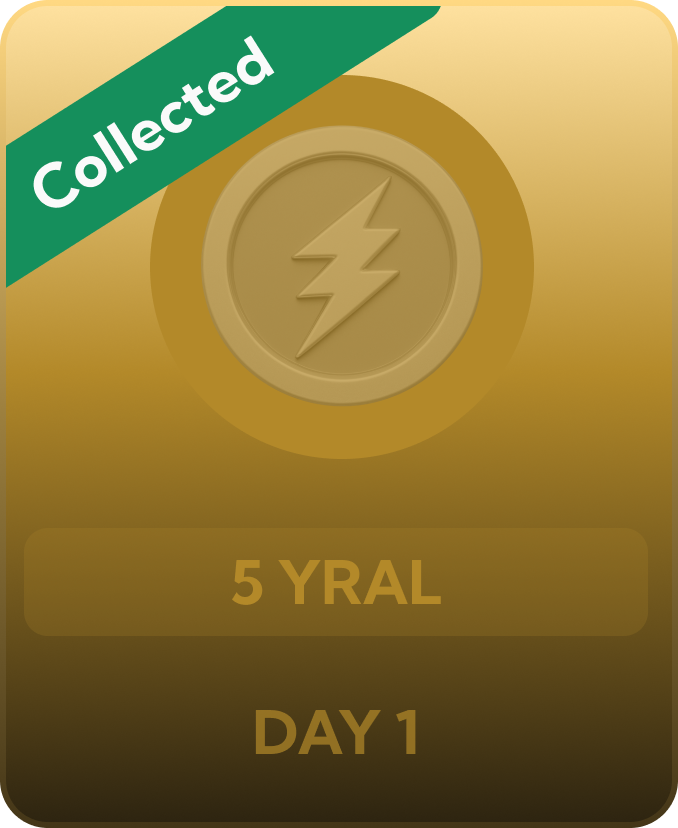
Completion stays visible, but the card no longer invites another tap.
Activated card

Today gets the highest contrast and the only live Collect action.
Preview
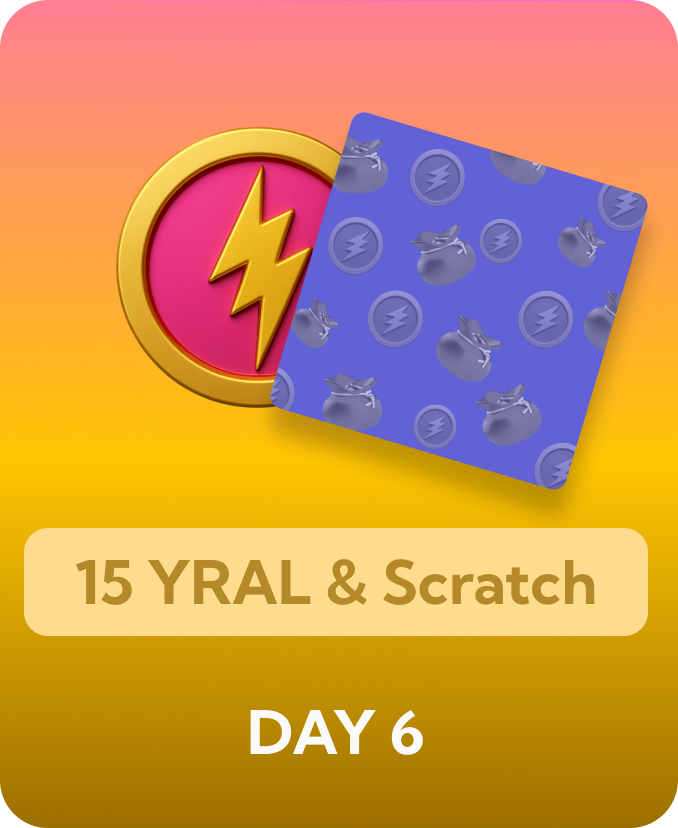
The reward stays visible, but no CTA implies availability.
Countdown answers “when?”

One countdown answers when the next claim becomes available.
Tooltip near the upcoming rewards
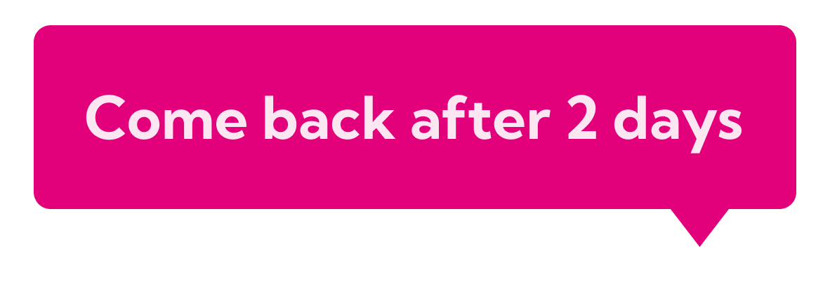
When tapped on a card, shows the number of days user have to wait.
One component carries progress
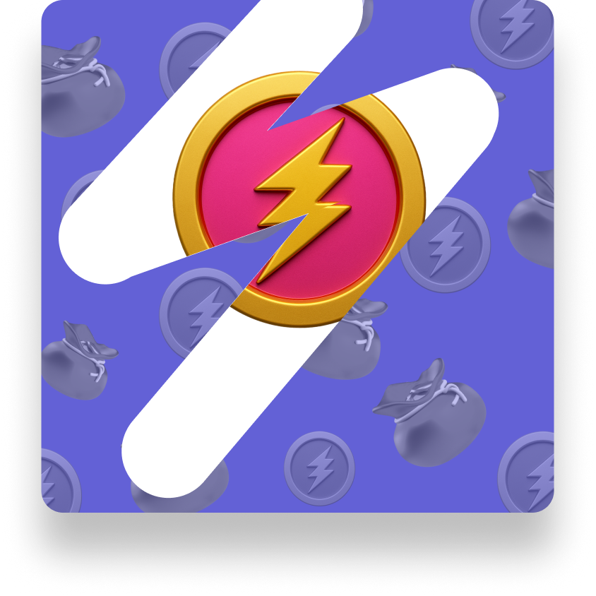
One surface moves from intact to scratched.
Reward Architecture
Progress first, delight second.
A daily reward mechanic works when the user understands the system before the surprise begins. I structured the experience around three layers: cycle progress, the immediate claim action and the Scratch & Win reveal.
A daily reward only works when the system is understood before the surprise arrives.
For Yral, the reward calendar carried the logic and Scratch & Win carried the delight, a short ritual that returns the user to the product instead of holding them in a side game.