Turning a daily emoji guess into a reason to check your rank.
YRAL APP · SMILY GAME · INTERACTION DESIGN
Smily Game asked users to choose the emoji they thought most people would pick. Matching the crowd earned points. I designed the leaderboard and reward feedback around one question: after a choice, could the user immediately understand what changed and why it was worth coming back?
CLIENT REQUIREMENT
Make scoring, rank and the next reason to play feel clear without turning a lightweight social game into a heavy gaming system.
The Brief
The leaderboard had to explain the game, not just display a table.
Explain consequence
Find “me” quickly
Create a return cue
Game Loop
The interaction loop was short: choose reveal reward rank return.
The leaderboard works only after the game has made the scoring logic visible. I treated the post-choice moment and the leaderboard as one continuous interaction rather than two unrelated screens.
Choose
Pick one emoji.
Reveal
See the crowd’s choice.
Reward
Earn points when aligned.
Rank
See daily / weekly position.
Return
Know when to play again.
Interaction Design
Every state had to answer one question before asking for the next action.
Rather than add decorative game UI, I used hierarchy and short feedback moments to make cause and effect legible.
Choice is locked
Confirm the selected emoji immediately so there is no ambiguity about what was submitted.
Majority is revealed
Show the crowd result before the score so the user understands the rule behind the reward.
Rank is updated
Translate points into a visible change in position, with the user’s row easy to scan.
Leaderboard Hierarchy
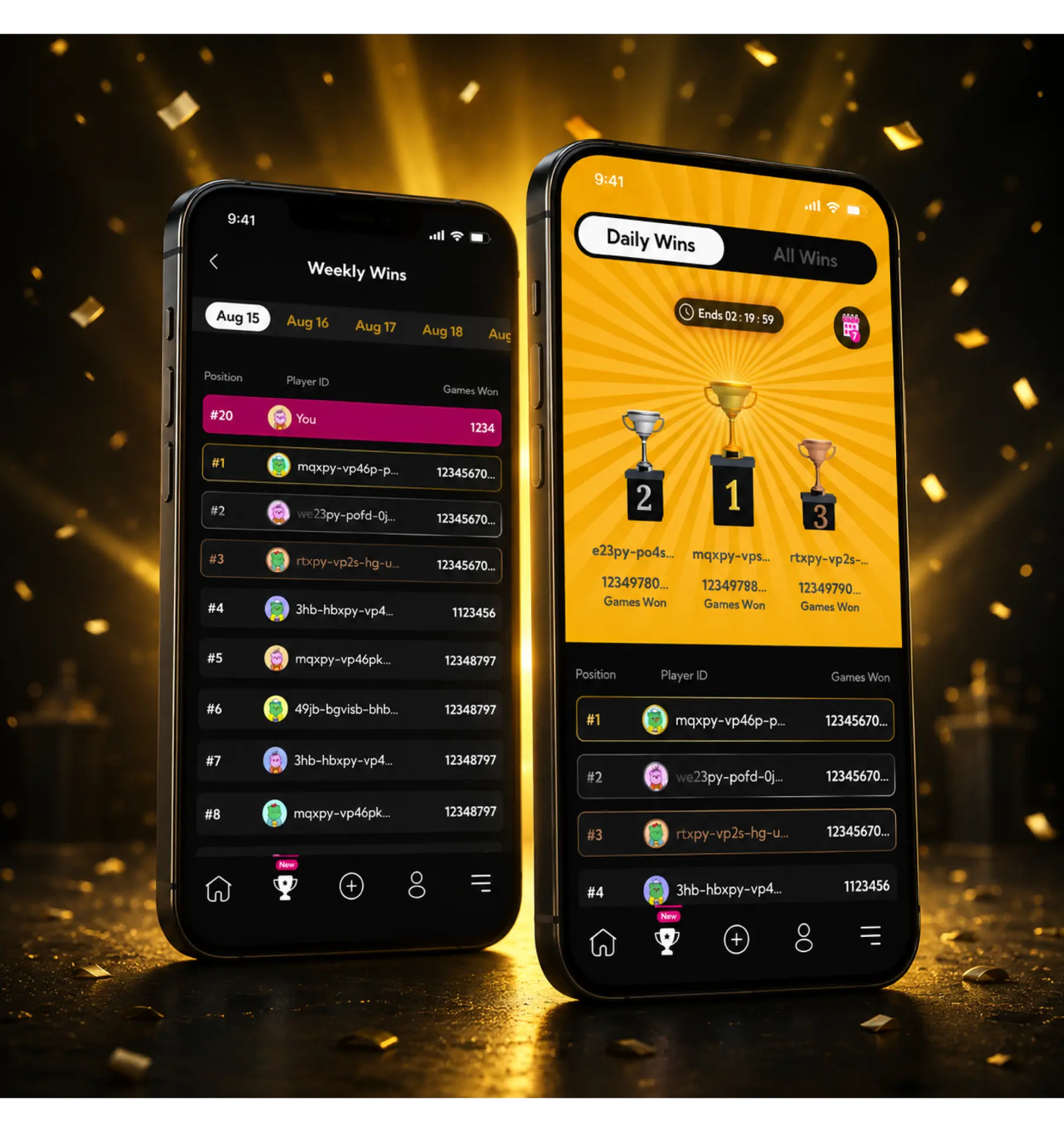
Competition needed hierarchy, but the user’s own progress had to stay primary.
A leaderboard can become visually noisy very quickly. The design separated celebration from utility: the podium carries the competitive energy; the list carries scanning; the highlighted “you” state carries personal relevance.
Motion & Feedback
Motion carried consequence, not decoration.
The interaction references were used to keep feedback short and functional: acknowledge a choice, reveal the result, celebrate a meaningful gain, then get out of the way so the user can read the leaderboard.
Acknowledge
Selection feedback should be immediate. No long celebration before the result is understood.
Reveal
The majority result appears before or with the point change so the reward has an explanation.
Settle
After a brief reward moment, the UI settles into a stable leaderboard state for scanning.
A leaderboard should not merely show who is winning. It should explain what just happened and make the next round feel worth returning for.
For Smily Game, the interaction system connected choice, majority behaviour, reward and rank into one understandable loop.